
|
Portrait photography, or portraiture, is a type of photography aimed at capturing the personality of a person or group of people by using effective lighting, backdrops, and poses. A portrait photograph may be artistic or clinical.
“I believe that everyone wears a mask, and beneath that mask is another mask. So what photographers can reveal are the various masks we all wear.” I find this quote inspirational to this project as it connotes meaning about how a photographer can reveal a subject’s true self and no longer hide behind an artificial mask. Furthermore, it shows that a person can have different identities which can be captured by a photographer by exploring different techniques such as camera settings, angle of portraiture or types of shot. Rolston's advise to aspiring photographers is develop your own style, 'expand your mind' and 'become passionate about the things you are attracted to' (Rolston, Matthew, LACP). I like this advice and will aim to adopt this approach in this project.
|
Mind Map : |
YouTube |

|


|
I created a mind map to develop ideas for my project and used YouTube videos to begin my research
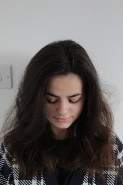
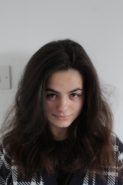
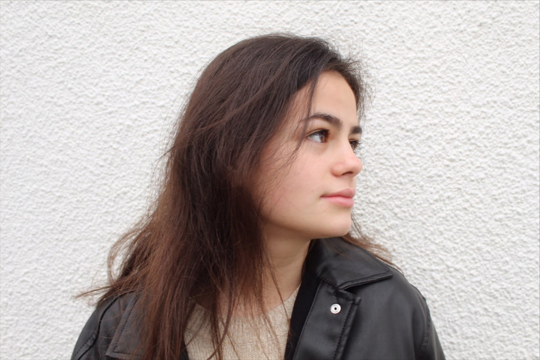
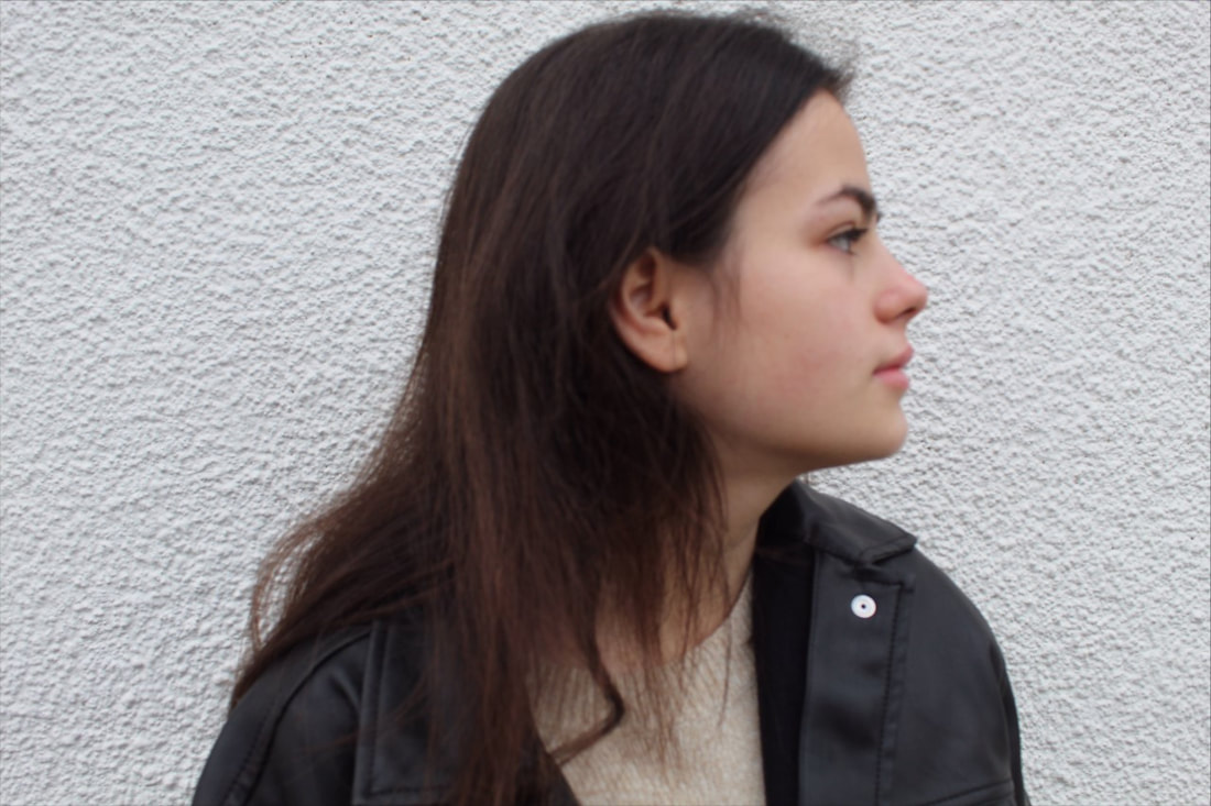
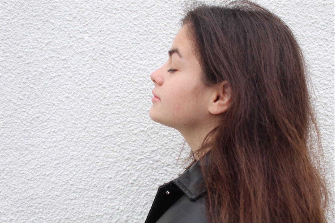
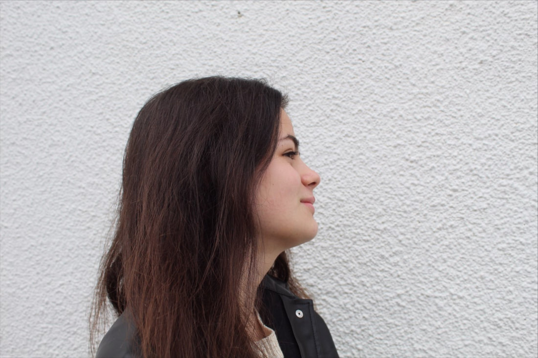
Early inspirational images:
Following the written Mind Map, I then researched portrait photography and identified examples online. Below are my findings of this research. I feel that the most inspirational images for me are the mixed media portrait photographs as they show a lot of detail. It connotes meaning through photography as it uses words, abstract colours and shapes.


Professional portraiture workshop / Collaborative shoot


|
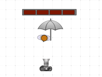
Firstly, I watched the 2 videos above and then completed a knowledge organiser. I developed my vocabulary from the sheet and now understand lighting in portraiture such as rim lights, key lights and fill lights. This helped with my project as it will help me use light effectively. For example, it will help me use the light to cast shadows to add atmosphere.
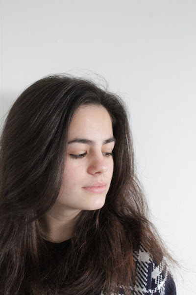
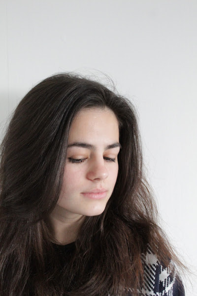
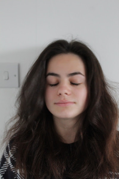
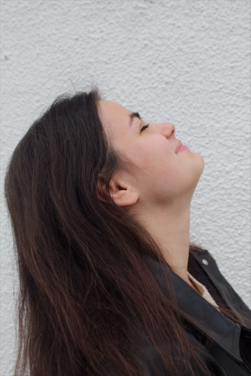
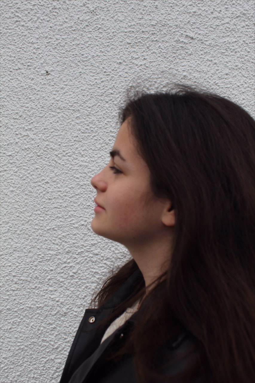
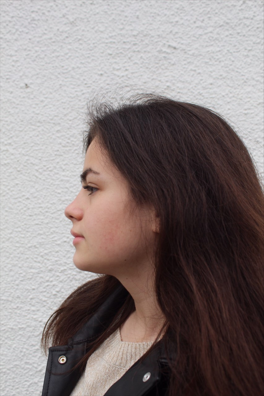
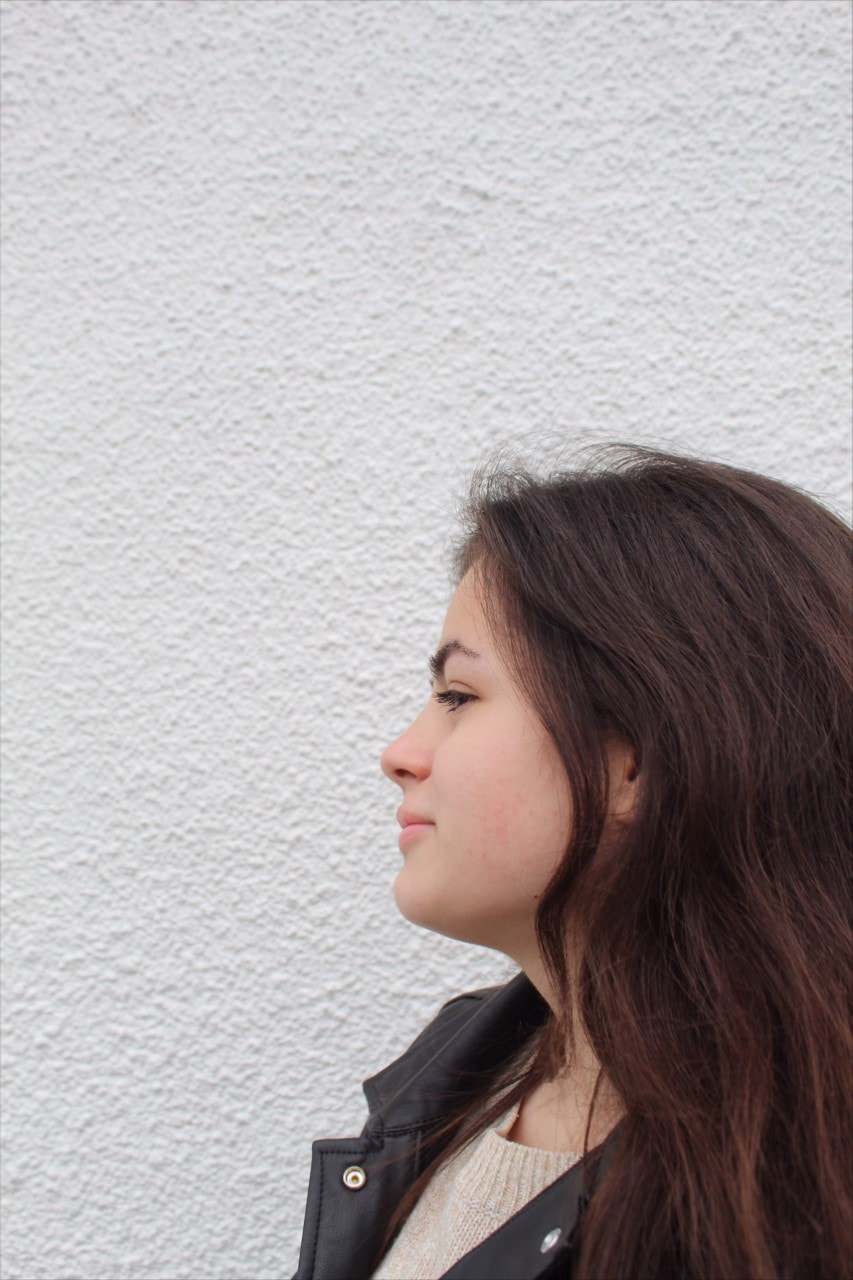
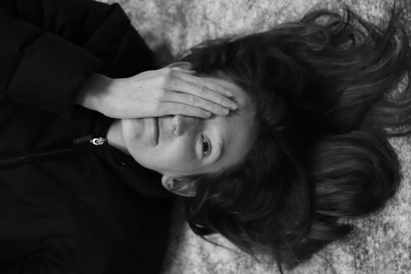
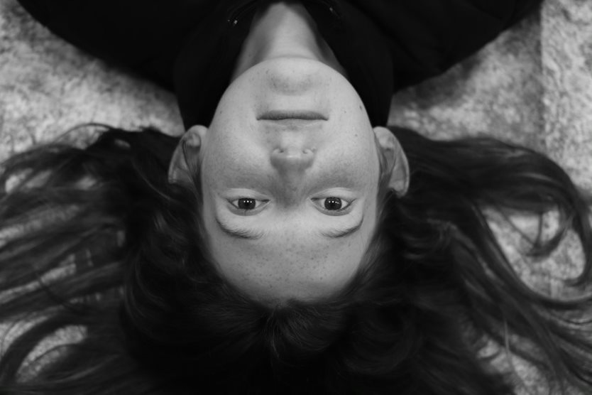
Mr Dever is a professional Freeland photographer who helped us with the shoot. The aim was to take pictures of year 11's; who had missed their shoot due to Covid isolation. For the shoot, we used: soft boxes; to give the image a softer look; lights; which highlighted and created shadows on different parts of the image; reflectors to reflect the light on the face; a white background; to ensure the person was the focal point and there were no distractions; tripod to avoid motion blur and flash remote, again to make sure the image was not blurred . I crossed out the pupils’ eyes and we only used their initials for confidentiality. We were all socially separated from the sitter since each model was wearing a facemask, which they only removed momentarily during the actual shoot. Facemasks were also worn to help prevent the spread of COVID. Other hazards, like as camera shaking and glare from spectacles, necessitated modest adjustments to the scene each time to suit the sitter. Sitters were notified about potential trip risks, allowing them to take their seats safely. |
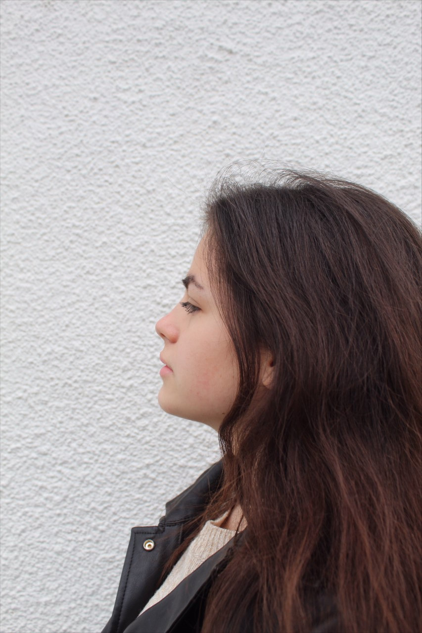
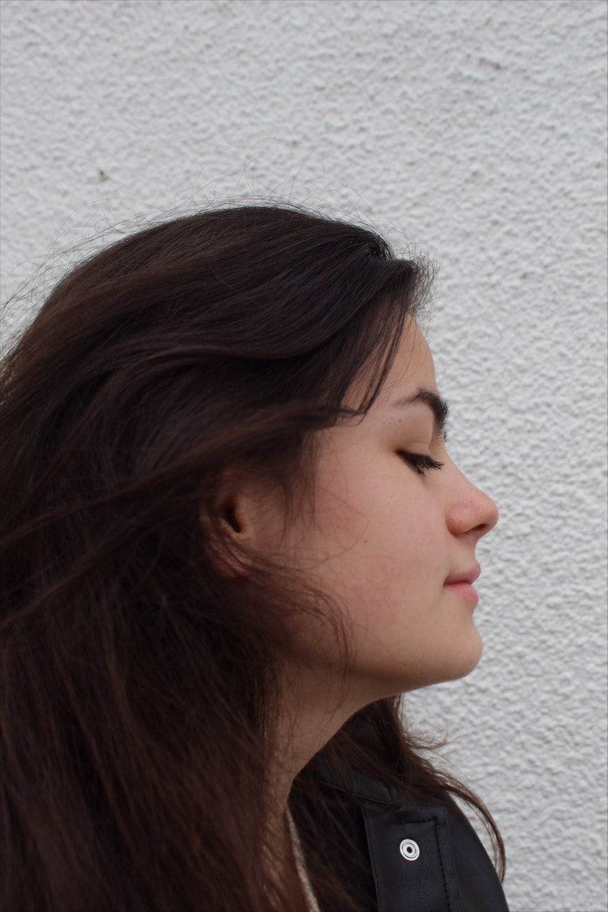
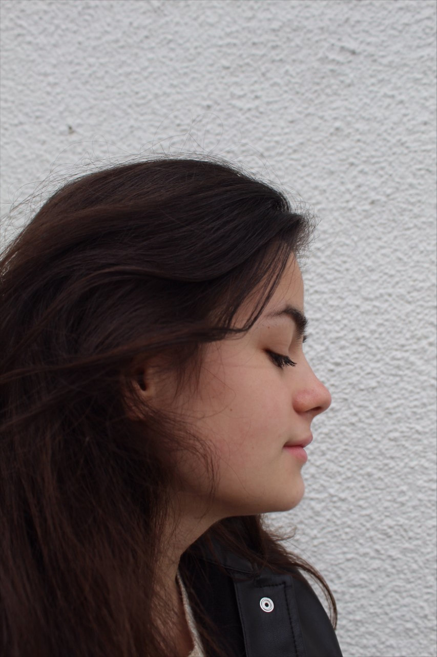
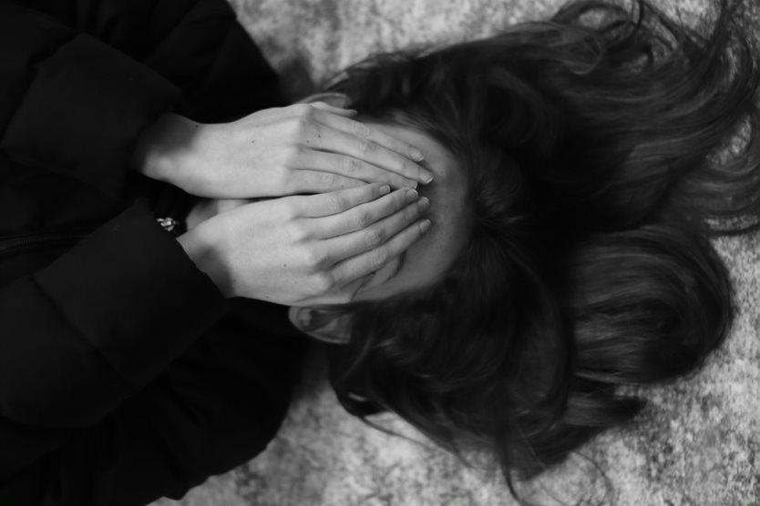
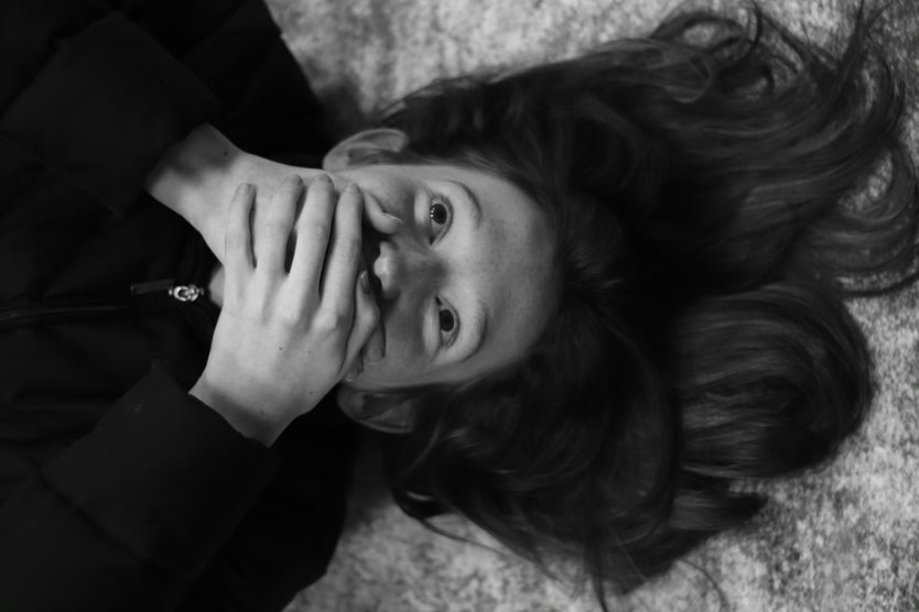
Professional portrait contact sheet

Professional portraiture workshop / Digital editing

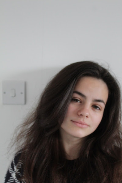
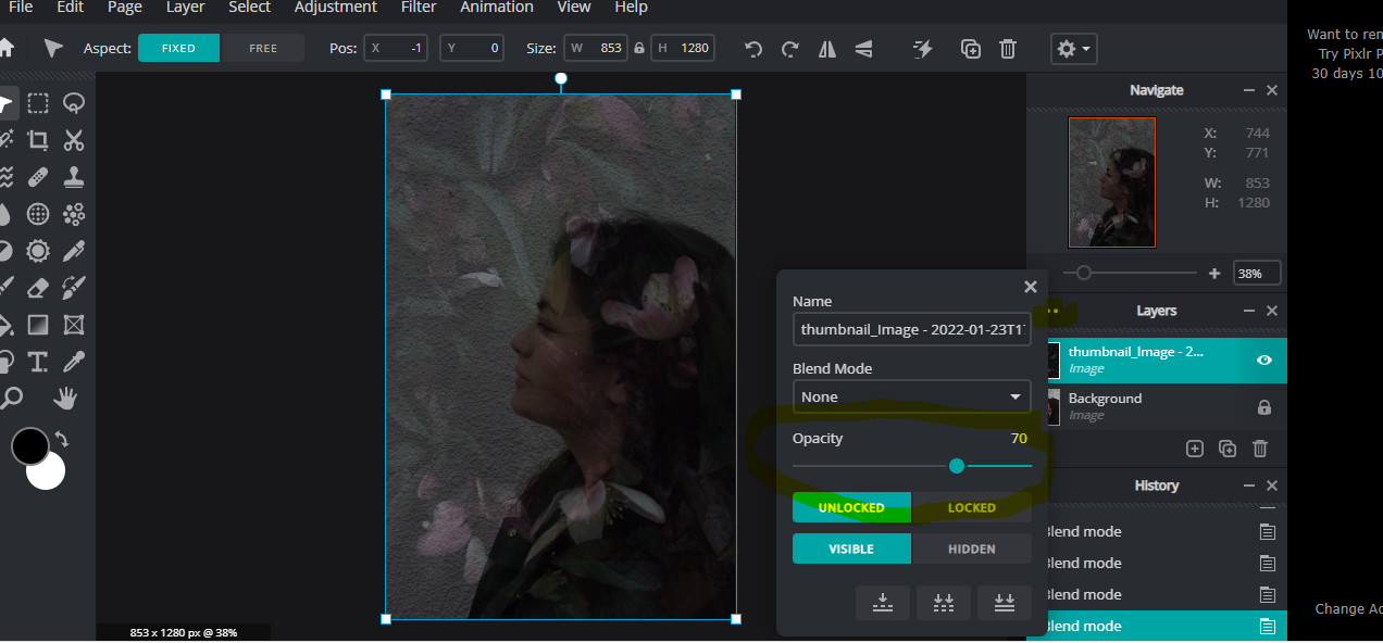
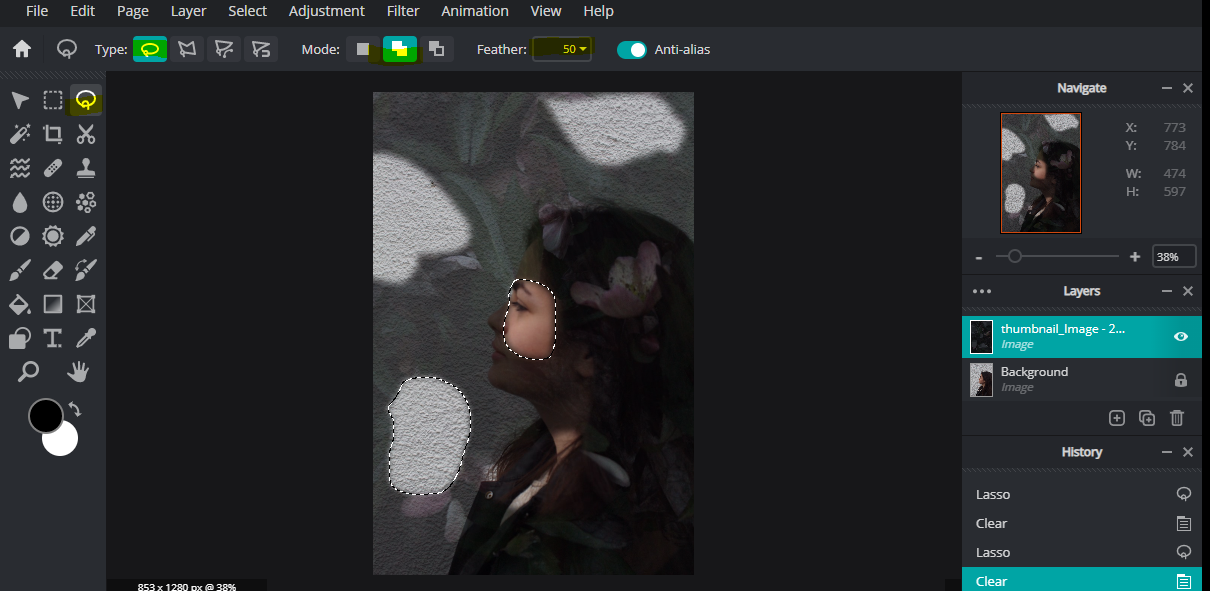
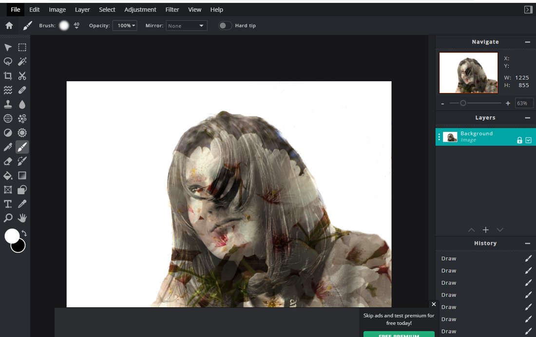
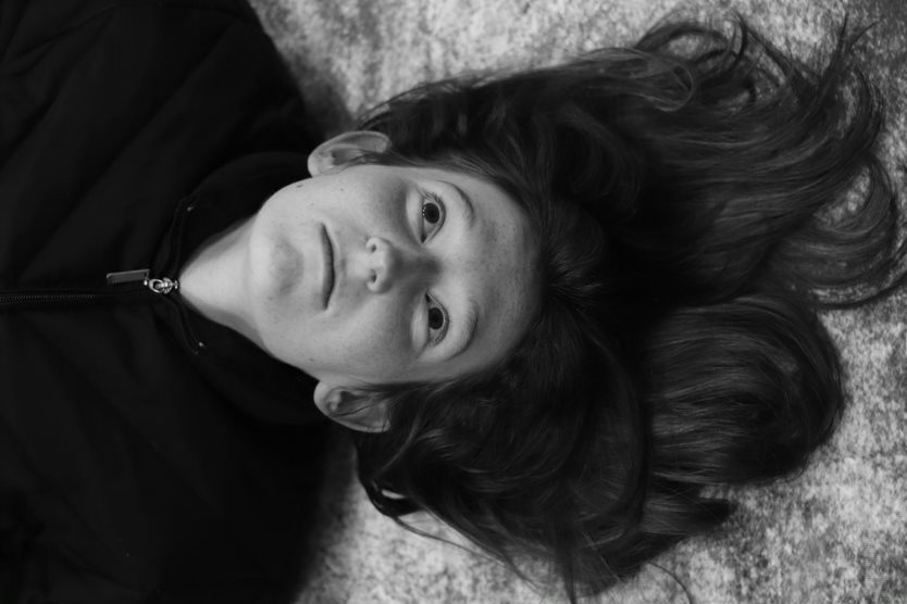
I used the editing app PIXLR to crop this image, using the rule of thirds to ensure the subject was in the centre. This would help to create a professional and more balanced picture was taken which would be more appealing to the viewer. Then I used the cloning tool to remove the chair so that the image was more seamless. This created a less cluttered image so that the viewer could focus on the person’s portrait without distraction. Finally, I used the magic wand lasso tool to select the background and applied the blur filter to remove background defects which created a clearer professional image of the person, so the viewer was not distracted by the background. I was pleased with the final effect as a professional sharper photo was created, where the viewer could focus totally on the subject.
Research and investigation /breaking the rules
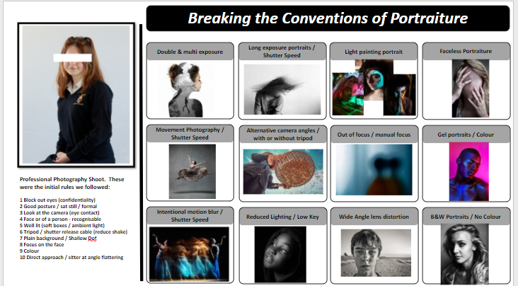
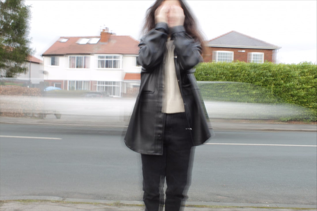
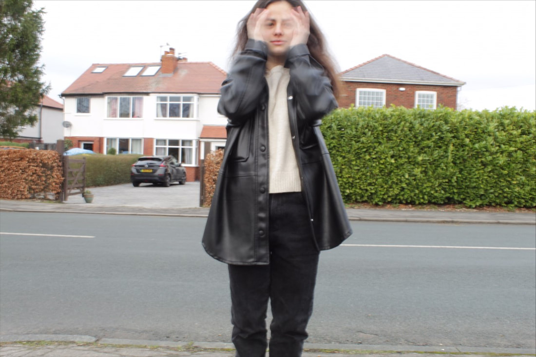
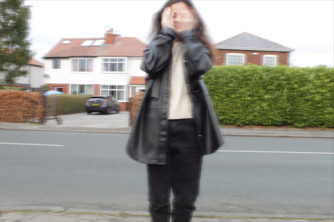
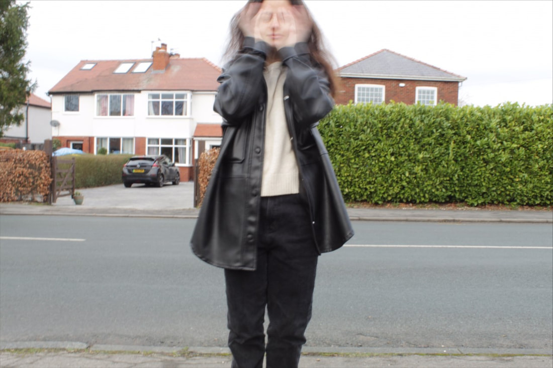
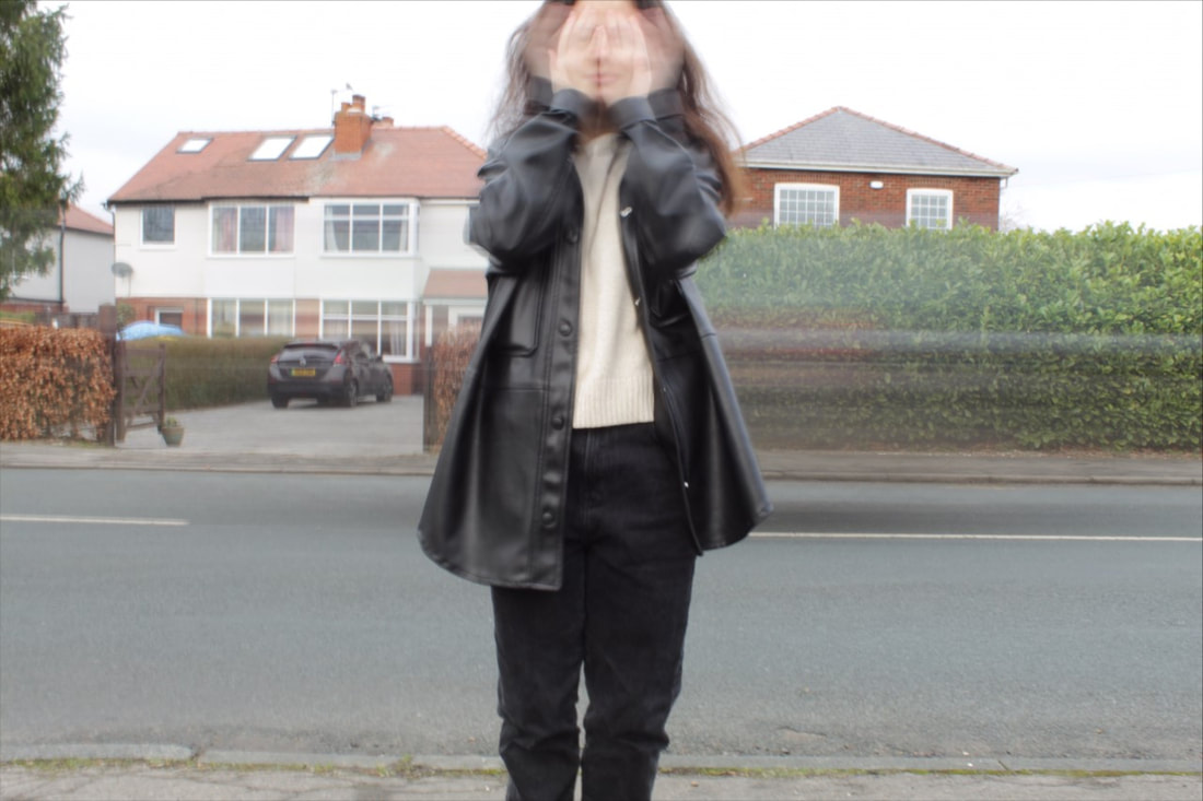
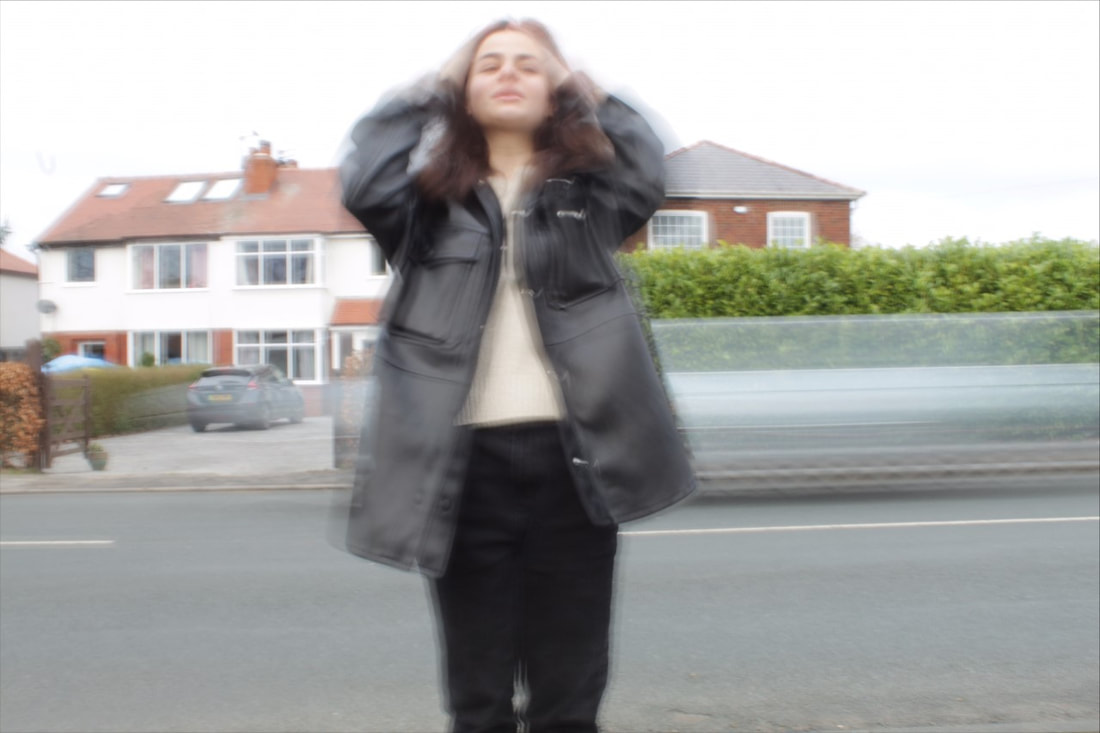
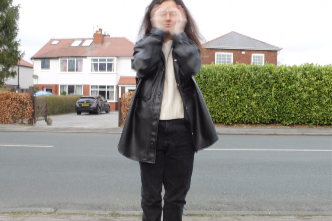
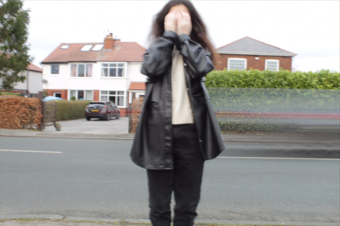
Research and investigation /double and multi exposure
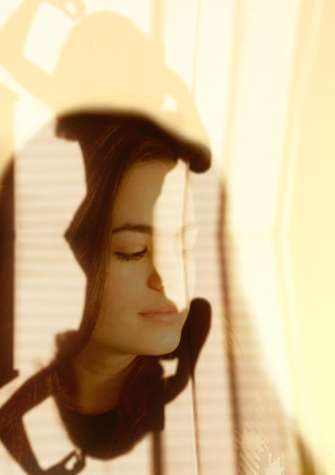
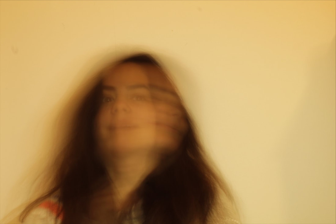
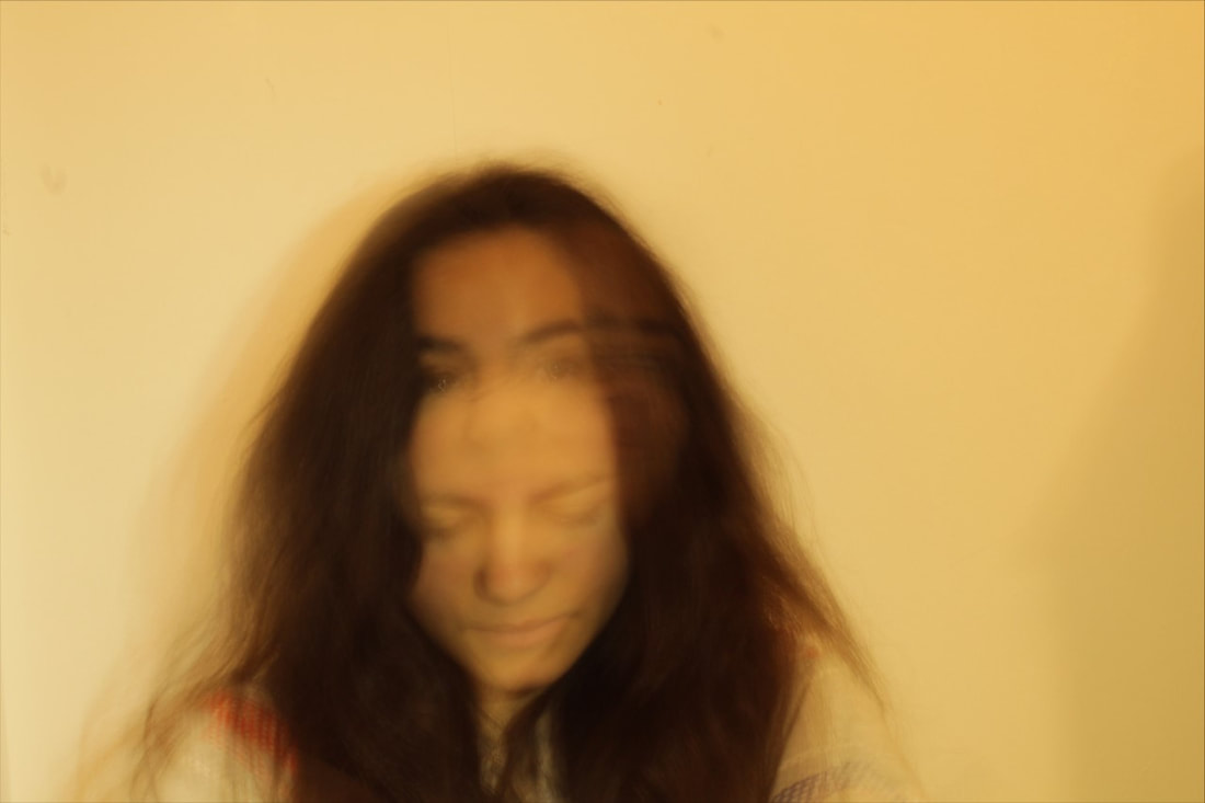
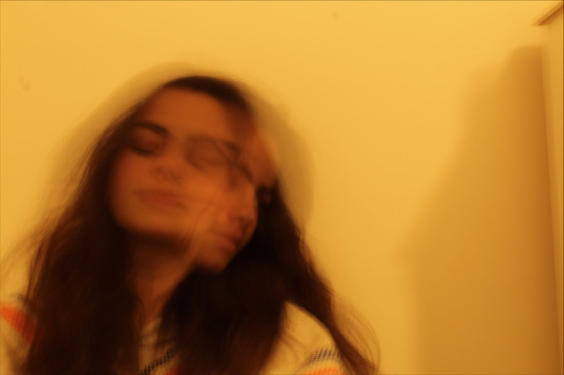
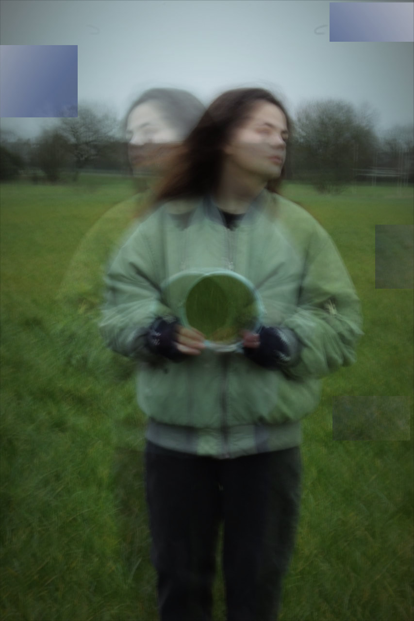
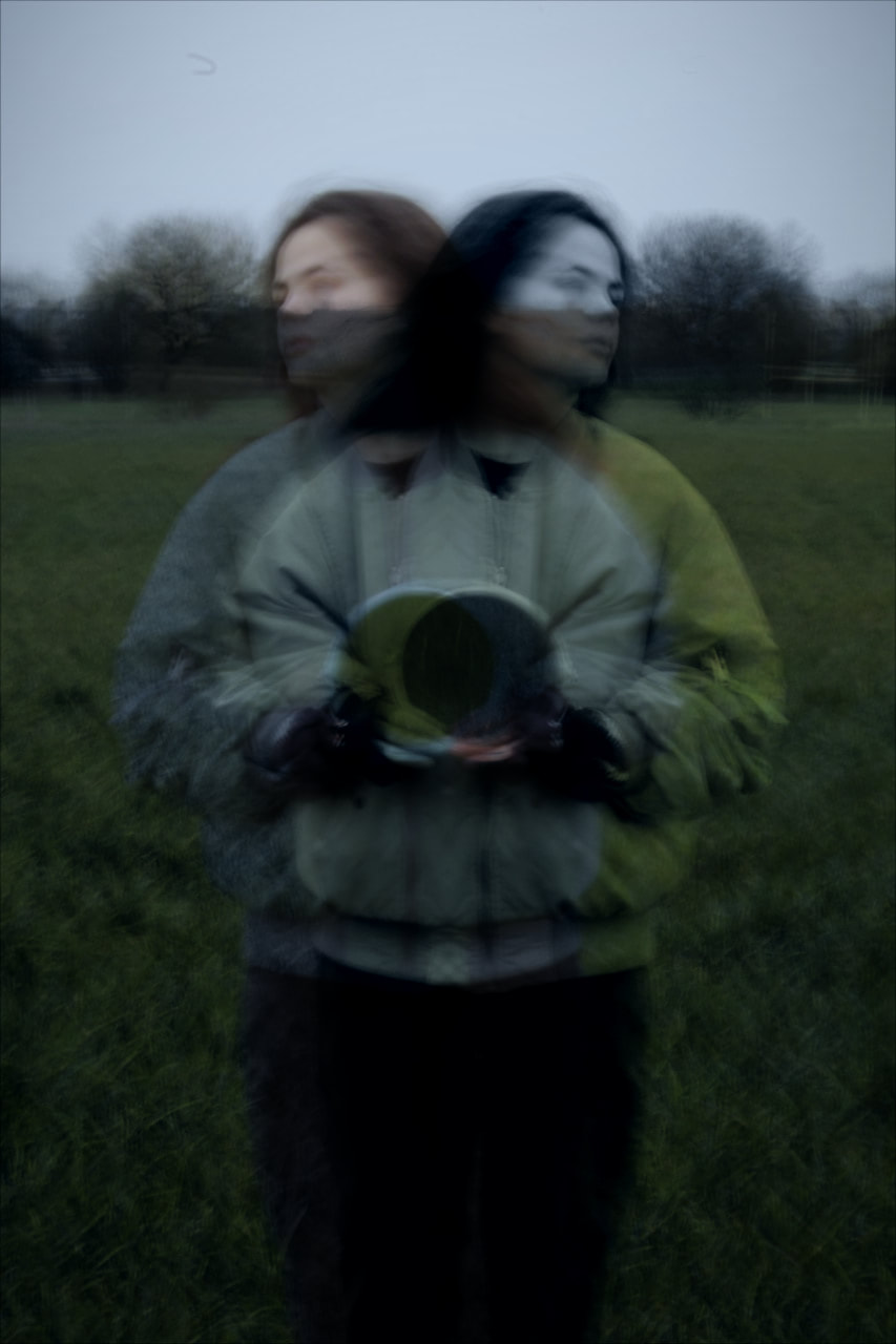
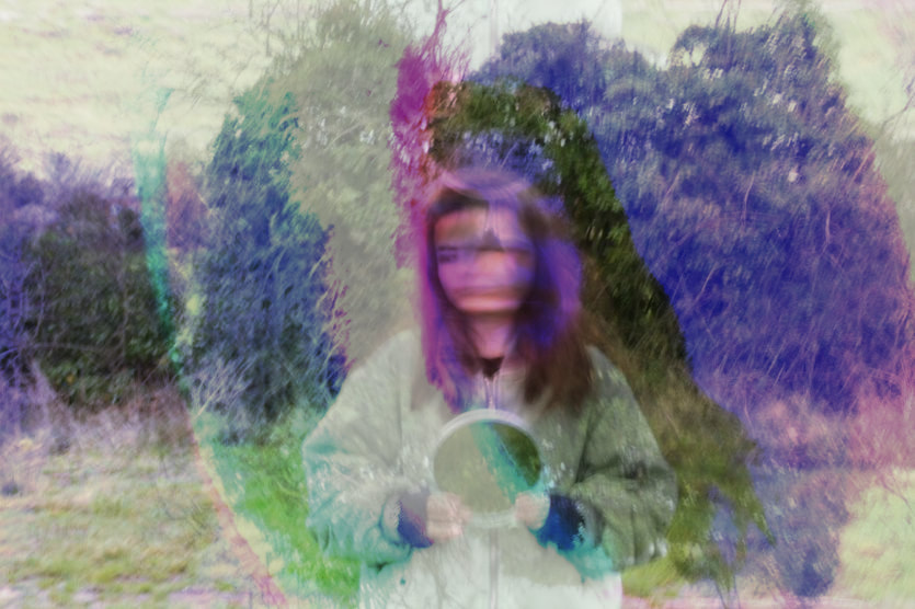
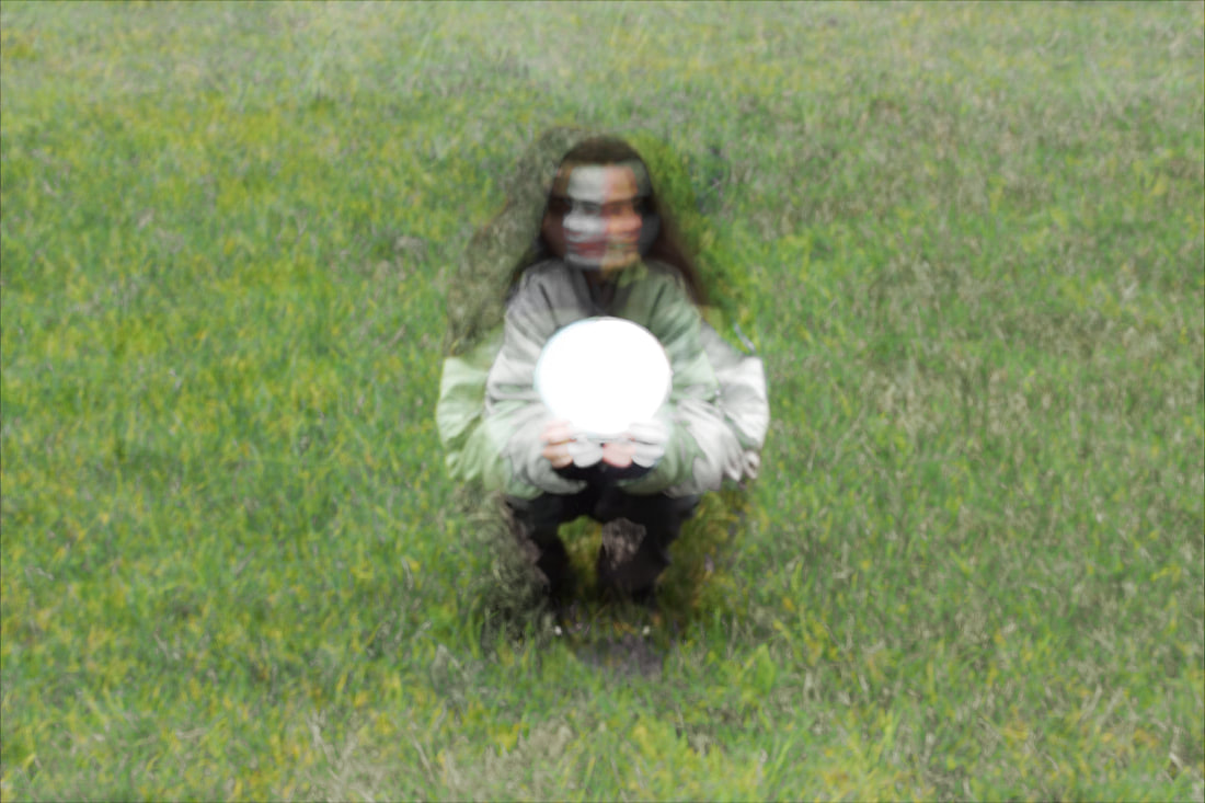
In photography and cinematography, a multiple exposure is where two or more exposures are combined to create a single image whereas a double exposure is where two exposures are combined, We have discovered how to make a portrait subject appear twice in a frame, as if they had an identical twin. In the historical technique of chronophotograph, dating back to the Victoria era, a series of instantaneous photographs were taken at short and equal intervals of time, allowing images to be overlapped. This created the effect that the person had two faces or bodies.
Contemporary Double and Multi Exposures


Research and Investigation / Double & Multi Exposure / Initial Experiments

|

|
|
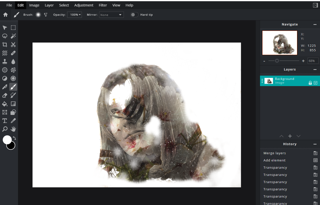
Overall, I was pleased with the effects I produced. I was able to create a degree of transparency by taking multiple shots and changing the exposure each time. The effect was to create a translucent layer which allowed the under layer to show through. This created depth to the image. I found it difficult to mask the overlay image creating an uneven finish. This impacted the final photo as it made it look less professional, To improve this, I would need to practise this skill first before I used it for real, zooming in closer to show the outline more clearly. This would be slower but would create a better finish. I also thought it would be interesting to experiment with different transparency levels to give the image new effects, The more successful shots exposed more of the face as the final image was more detailed which added interest for the viewer. I also felt I could improve the final image by adding colour and more overlays. This would add more depth to the final photograph.
Smartphone / Initial Experiment / Snapseed

|

|

|
|
|
|
Evaluation

|
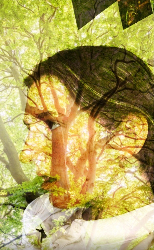
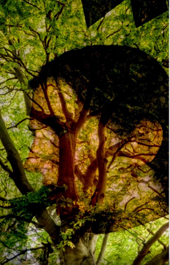
One of my favourite Snapseed shots is this one. I think the transparency works well here as the layers blend together creating a more uniform design with a good balance between the translucent layer and the underlayer. It is as if you can see into another person's mind, seeing her memories and reasoning. The tree branches frames the person’s face and her hair, and the leaves of the tree blend together, making it difficult to distinguish between the two. This gives the impression that the girl is at one with nature, creating a peaceful atmosphere. Furthermore, it is as if the photographer is able to get inside her head and convey this calmness to the viewer, giving them an insight into the girl’s thoughts and feelings.
The contrast between the hair and the background draws attention to the double exposure's second layer. Darker hair contrasts the light, creating a striking image. I used my own photos as overlays which worked well. The colours of the leaves and the girl's face worked well together as they complemented each other. There was also a contrast because the texture of the leaves and the girl's face, creating interest for the viewer. |
|
|

|
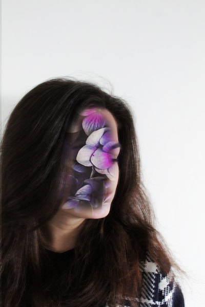
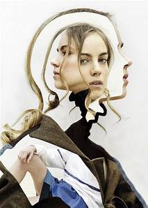
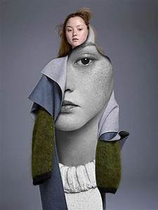
Artist Investigation / Denis Sheckler's


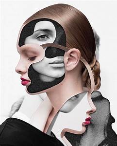
Denis Sheckler's work consists of edited face portraiture, which allows a unique view and perspective of his subject. He uses photoshop to transform woman's faces, as well as unusual overlays to help capture the mood of the scene. His images are often quite surreal even 'nightmarish' (Fisheye, https://www.fisheyemagazine.fr/en/scheduled/curiosities/denis-sheckler-lose-your-head-collages-curiosities/)
Sheckler often uses the rule of thirds in his images which gives a balanced image, drawing attention to the person's face, yet allowing the background to add to the mood of the image. The DOF can vary between images depending on the number of layers, the transparency and the contrast in tones. The lighting is different depending on the mood of the pieces (e.g. dull and cold image are created when there is not much lighting).
Several of Mr Sheckler’s images present women as energetic and vibrant as he uses bold colours and overlays which suggest a bubbly character. He often uses a number of different elements in his images such as space or the sky - see above. This creates a theme that runs through his images which makes the viewer reflect on his work and look for connections between the images.
Emulating/inspired Shoot Plan:
|
Firstly I'd emulate his work by taking a standard picture of a woman, using a tripod to avoid blurring the image. Then I would use Pixar to edit and manipulate the faces and, in some cases, cut out the face completely. I would think carefully about the editing in order to create a specific atmosphere.
|
|


|
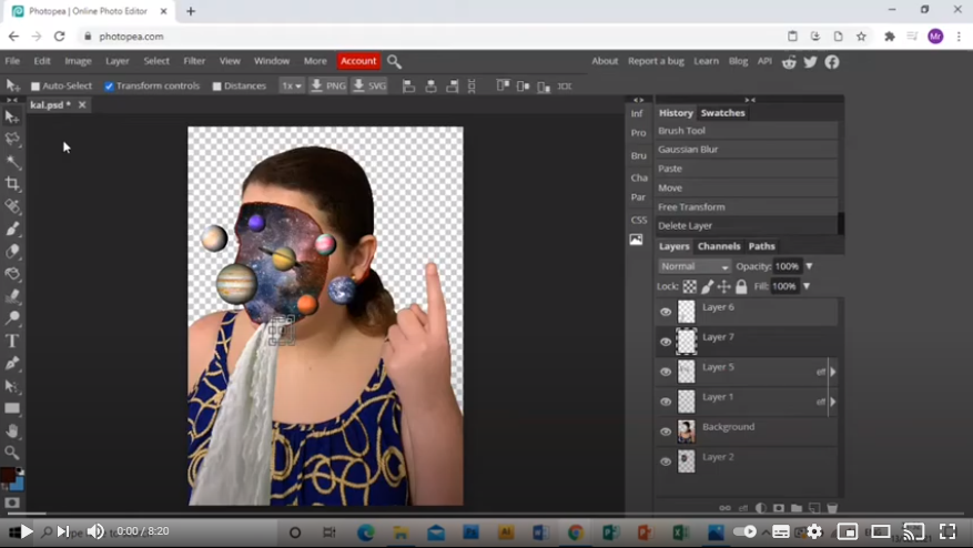
To do an inspired shoot I'd look at shadows and use Photopea.com to alter the photographs to create similar effects to Sheckler. By doing this, the identity of the person is more hidden and secretive, creating a more mysterious and more minimalistic image which will add interest for the viewer.


“We’re all constantly inundated with images, there is a common tendency, where even the most beautiful photographs with a variety of dialled parameters do not attract the proper attention, therefore it is necessary to invent something original, funky, and sometimes absurd things, which will make people look at the art of photography in a new way” -Denis Sheckler |
YouTube/ Denis Sheckler:

|
Contact Sheet:

Shoot:
|
|
|
|
|
|
|
Edited Images
|

|
|
|
overall, I think these edits went successful, i like the way the the overlay was flipped.
Edit Experiments
|
|
|
|
These edited were unsuccessful. However I included them for the purpose of experimenting with something different, and new.
Research and Investigation / Double & Multi Exposure / Sara K Byrne


|
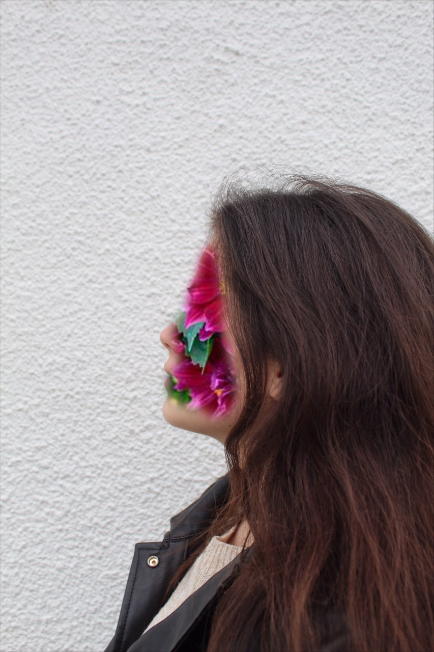
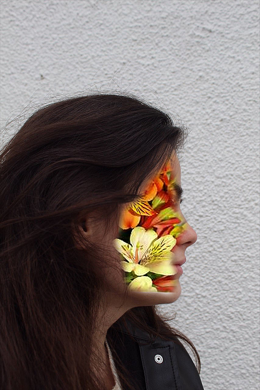
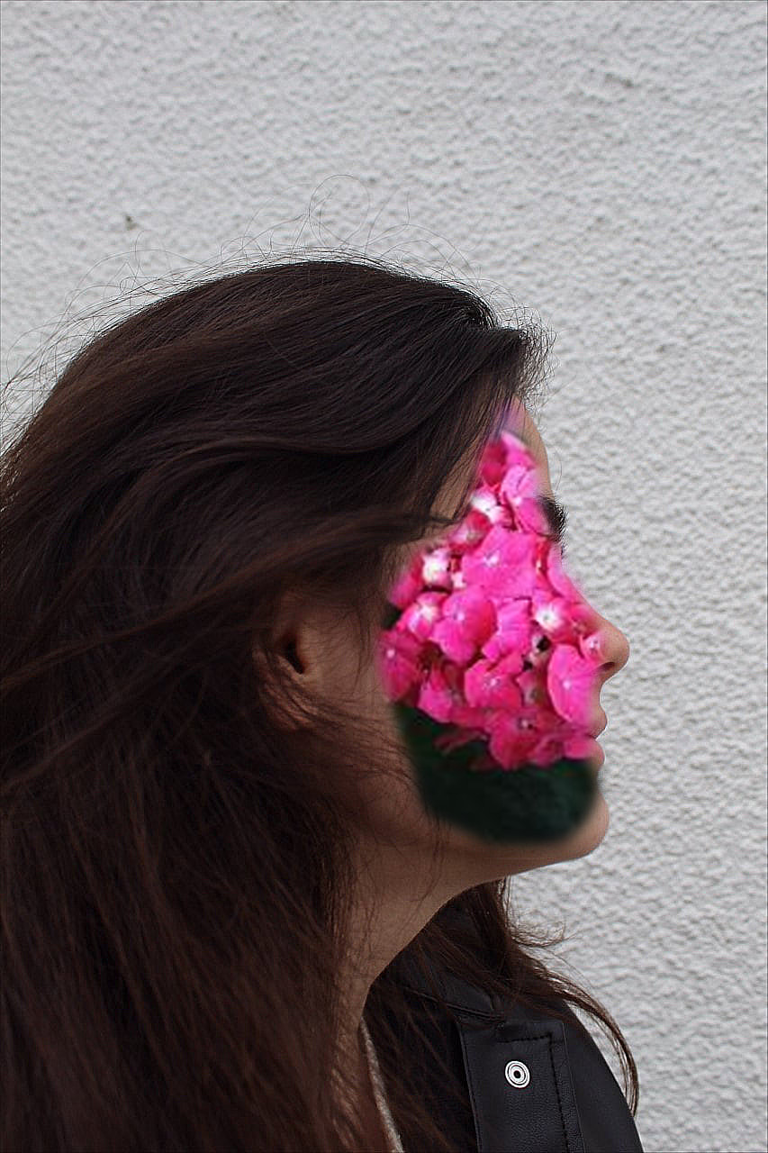
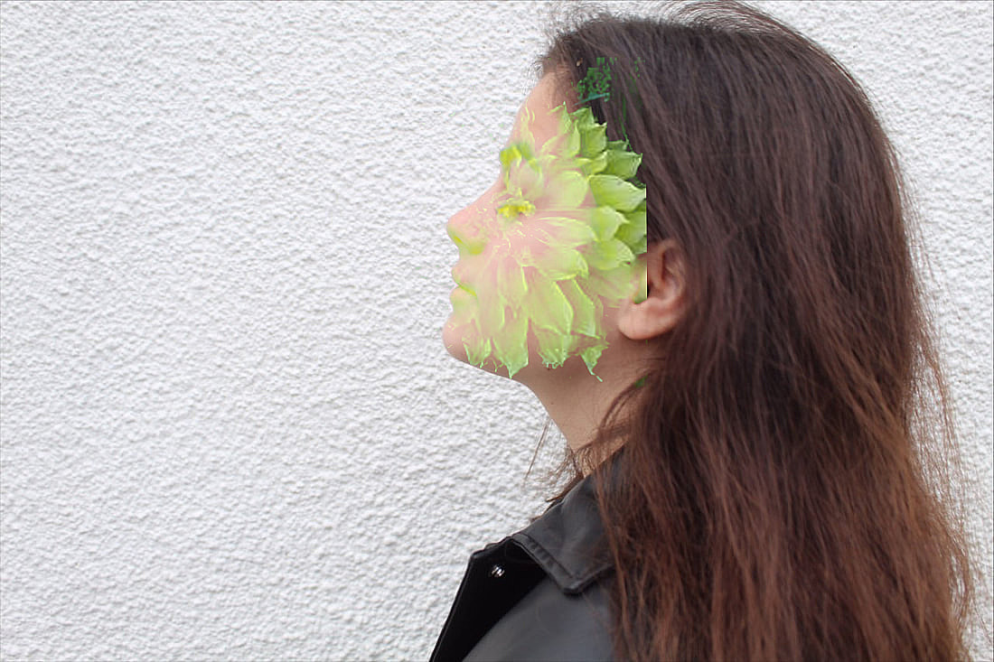
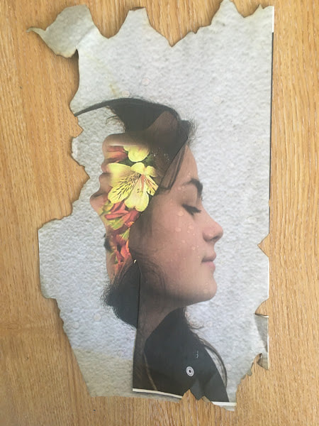
I choose this artist because she is deeply inspirational to me. The ways in which people’s forms are transformed into aspects of the natural world is quite unique. It gives the final image a kind of delicate and mystical feel. It has been described as 'fairy-like' and conjures up images of 'mid-summer's night dream (Resource Magazine Online). I think this is particularly true of the second image on the left, bottom row, where the outline of a women's face has been made from pink blossom that at first appears densely packed but then drifts away, creating a spiritual like feel. Byrne used three silhouettes and a long exposure to make this image
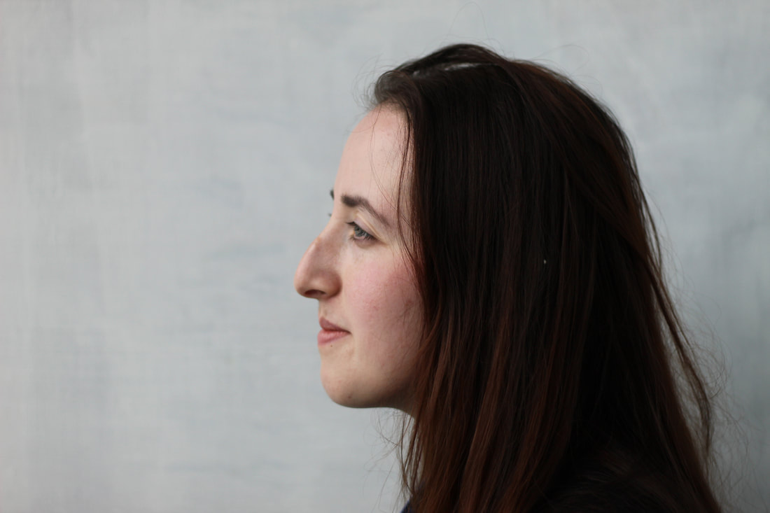
Her art is unique and eye-catching; you find yourself exploring the detail within the female images, yet you flit from the women's features to the natural world aspects, looking for meaning between the too. Some of the images are quite sensual such as the first image on the left, bottom row, where the dark tones and the presence of a male and female filled with natural imagery creates a unity between the two, drawing them closer. I particularly like the black and white images in the top row. The changes in tone, create atmosphere, giving a seductive feel to the image; the way the foliage trails off behind her again gives her a spiritual look as if she is lost in another world. The contrasting tones stand out against the plain backgrounds highlighting the female faces and drawing out their detail. Most of Sara's photos are taken from a side profile. This is because the side view shows some of the most prominent parts and form of the human face like the nose, chin and neck and adds more dynamics to the overall piece, making sure the human form is conveyed as in the final image. The human face is often just an outline. Byrne uses long exposure shots so that the light seems to come from the women's head through the images of nature. In the photos like the image bottom right shown above, the yellow leaves blend together creating a warm, soft image. |
YouTube clip:
I like people and I’m fascinated by their stories~ Sara This suggests that Sarah is fascinated in exploring a few of the billions of stories that exist on our planet. Her job requires her to talk to people and watch from the background and capture discrete moments in their lives. I think in order to capture people in the way Sara does, it must mean she loves people as they come across at ease.
Getting to witness real love every weekend and curating that story with my camera is one of the most fulfilling parts of shooting weddings Sara Byrne I'll need a model for my shoot in order to mimic Sara's portraiture work, but I won't have any props and will have to rely on the natural world and landscape surrounding me. I'll take the photos outside at school in the daylight to obtain a bright, clear shot with natural lighting. I'll be using my DSLR camera and the kit lens that came with it. Finally, in order to properly imitate Sara's work, I want to digitally edit my pictures using tools such as PIXLR or snapseed to bring in the multiple exposure effect.
In conclusion her art is eye-catching and speaks to me on a different level and that is why I picked her. Her work often involves feelings of love and a closeness to nature, which leaves viewer's with a warm summer glow. |
Website
Shoot:
|
|
|
|
|
|
|
|
|
|
|
Edits:
|
|
|
|
|
|
Research and Investigation / Double & Multi Exposure / Contact Sheet Research
Investigation / Double & Multi Exposure / Digital Edits
Step 1 - In this stage, I adjusted the brightness and contrast, Foloowed by the highlights and shadows, and the exposure. I also adjusted the curves and levels to brighten up the image
Step 3 - To further add to this effect I duplicated the overlay layer and added the screen effect to give the image more depth and create sharper contrasts. To edit photos in the style of Sara K Byrne I used Pixlr.
Step 5 - Then, I used the brush tool again but with a lighter opacity to give the images a faded effect to emulate the style of Sara Byrne
|

Step 2 - Then I added the overlay from the images I took at school and adjusted its transparency to create a translucent effect. Then I adjusted the highlights and shadows of the overlay and used the snip tool to remove parts of the layer that weren't needed.

Step 4 - Next, I used the white brush tool to smooth out the background and get rid of any blemishes to create a completely plain background. This was so there was no distractions, directing the viewer to focus on the subject.

Step 6 Finally, I used the bronze dust overlay on the image and increased the transparency to the top to give the image more depth and make the image look more layered
|
Investigation / Double & Multi Exposure / My Digital Edits

|

|
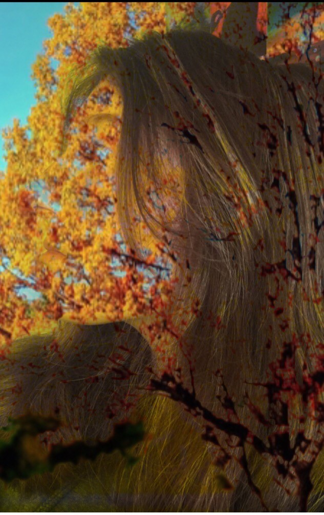
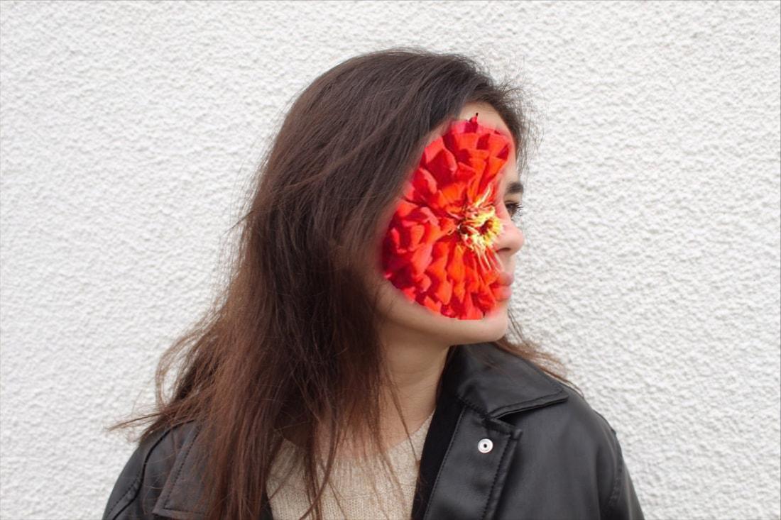
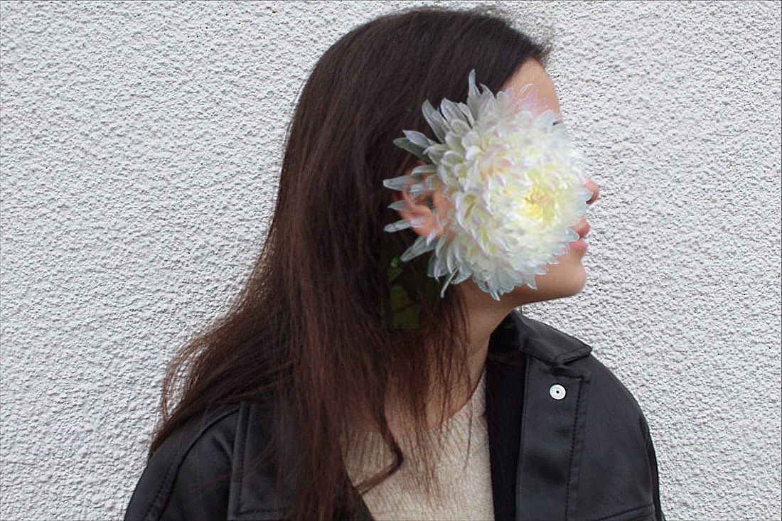
I was pleased with the two images I created (see above). In the image on the left, I like the way the leafy background complements the model's hair. It is as if the twigs blend in with the strands of hair and the leaves add texture to the hair in quite a natural way. The busy feel of the background and hair make it appear as if the girl is lost in conflicting thoughts. This is in contrast to the image on the right. Here the background is plain white giving a more calm feel to the image. The large, smooth leaves appear to fall down around her, creating a serene atmosphere suggesting the girl is a peace with herself and the world around her. This is enhanced by the light highlights. In the first image I did not feel the red and orange patches on the girl's chin and right eye respectively work well. The red appears as a large scratch which is bleeding which was not the look I was intending. The orange patch makes the girl appear muddy. The combination gives the girl a dishevelled look. In contrast in the second image, I feel all the effect work as intended. I like the patches of green on her face as they add to the calm, serene effect, making her appear at one and peace with her surroundings.
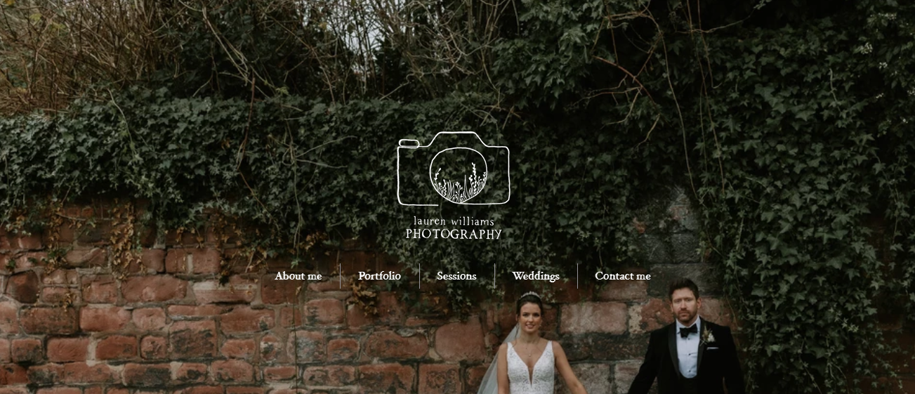
Artist Investigation / Laura Williams

|

|

|

|

|

|

|

|
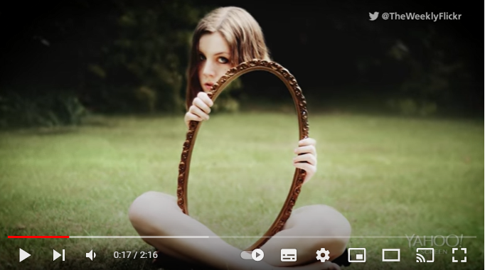
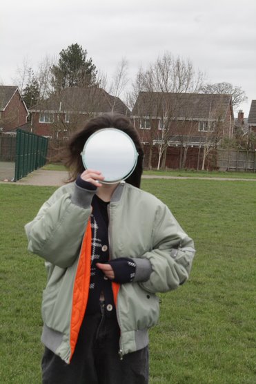
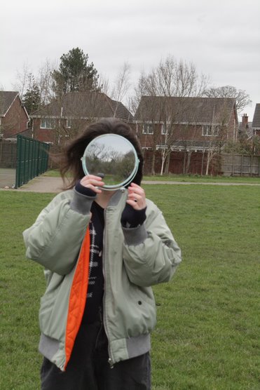
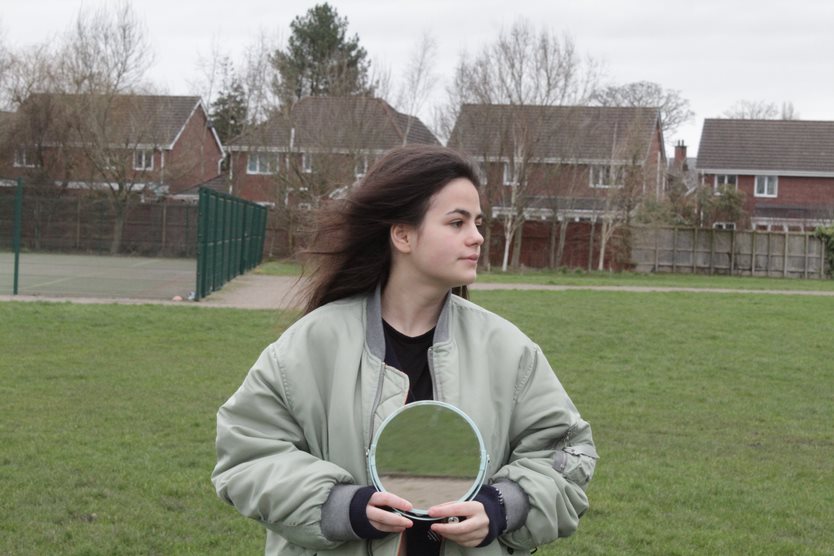
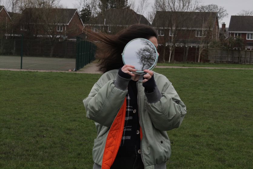
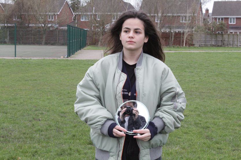
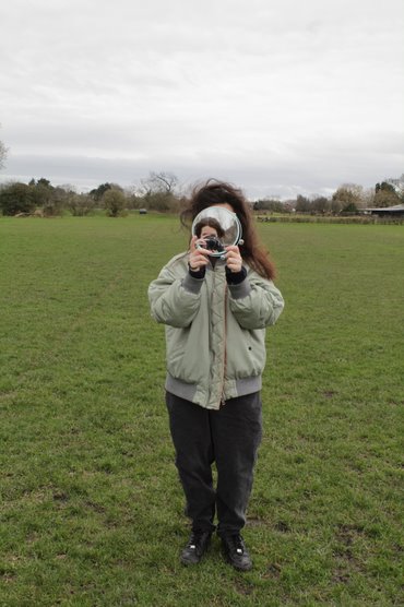
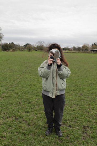
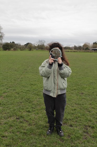
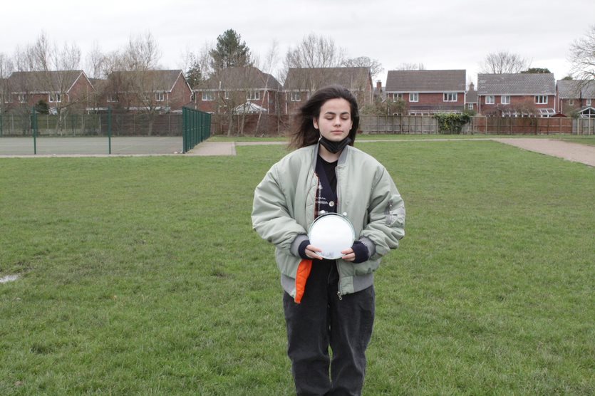
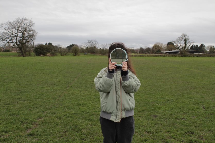
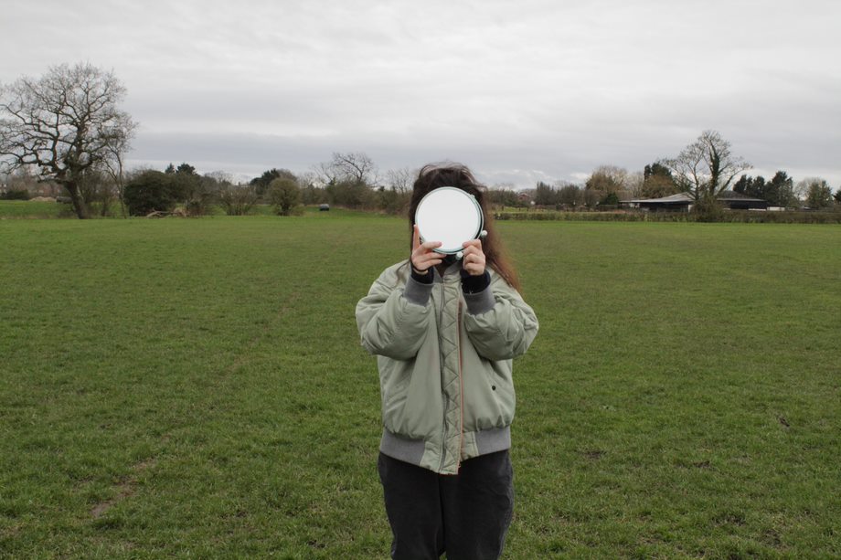
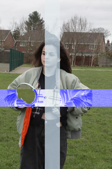
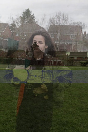
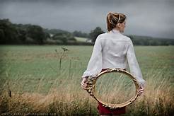
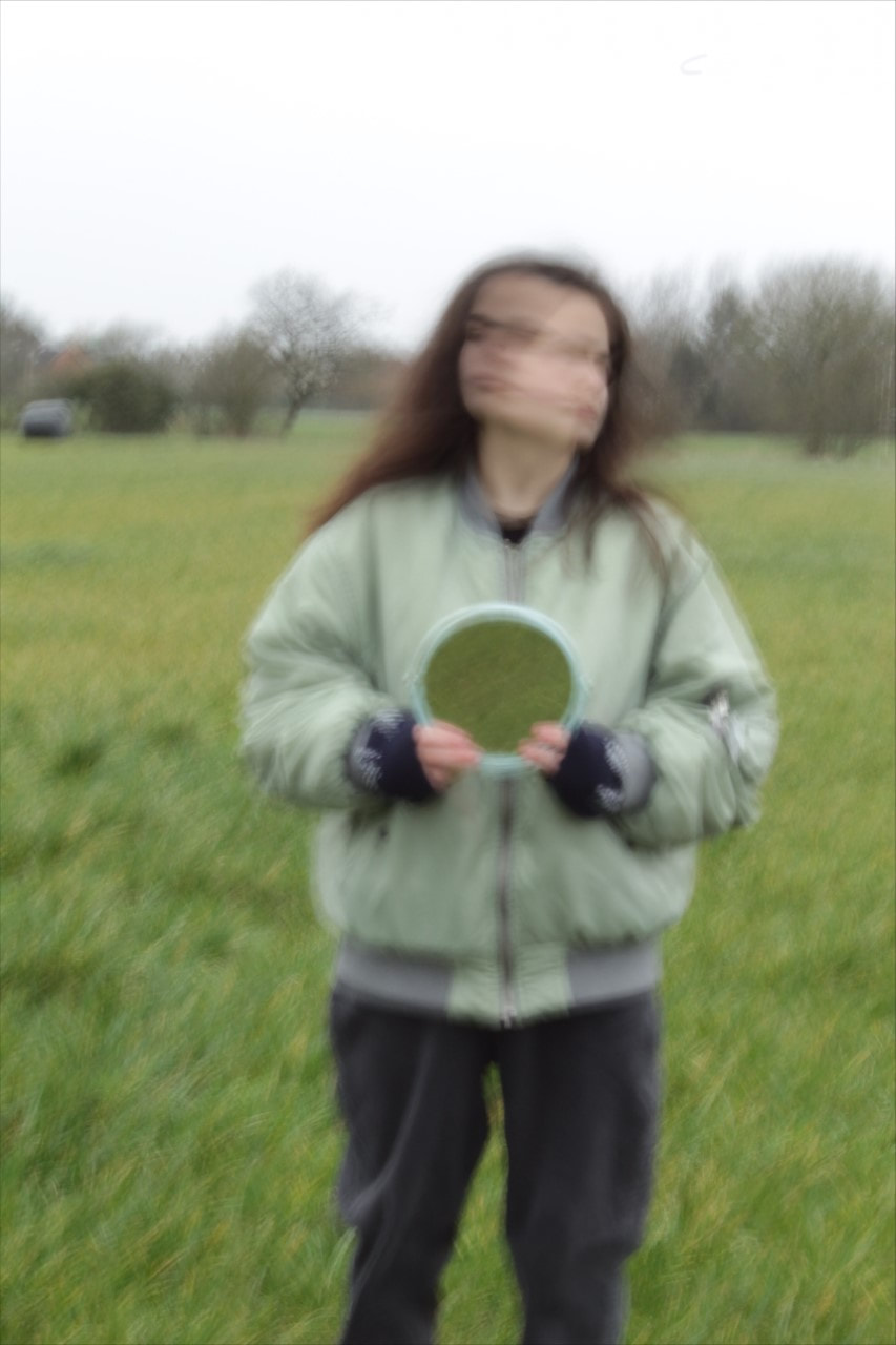
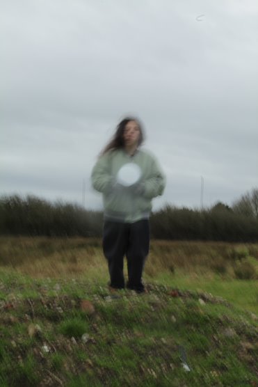
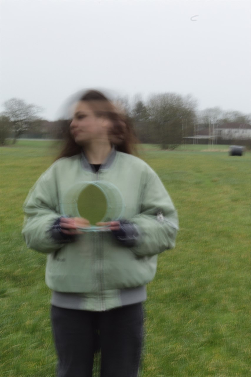
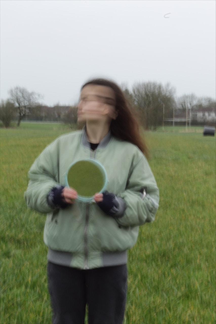
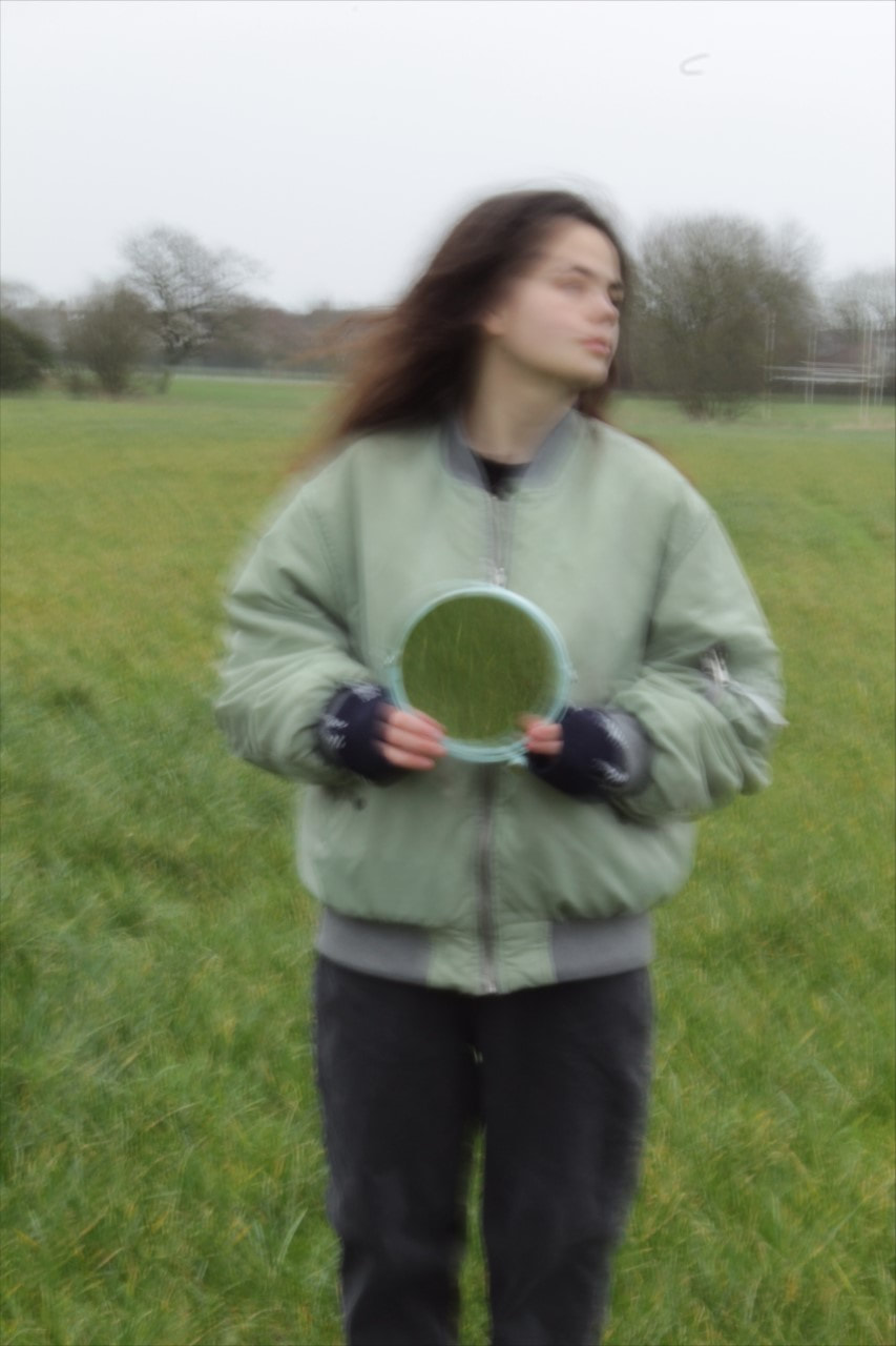
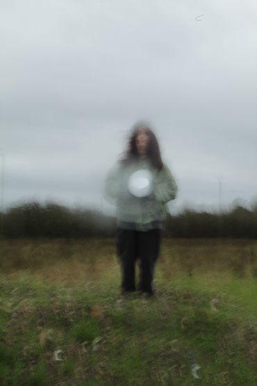
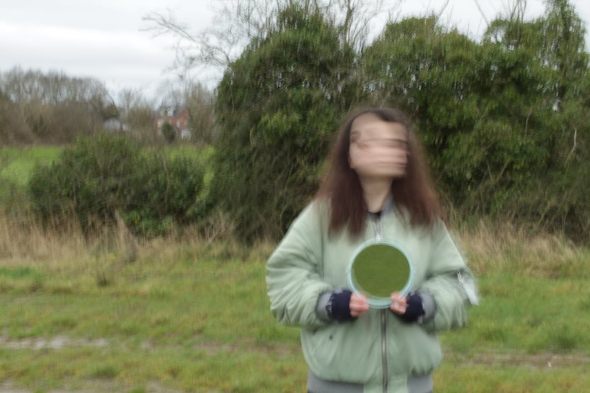
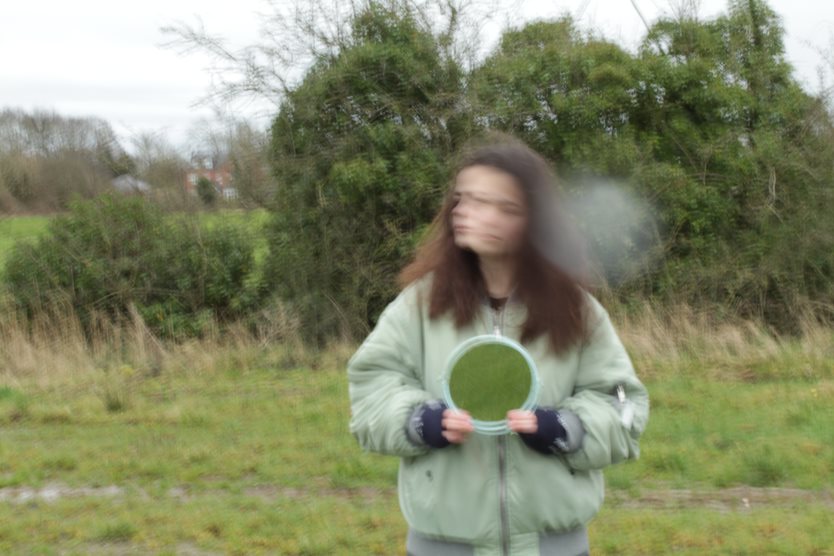
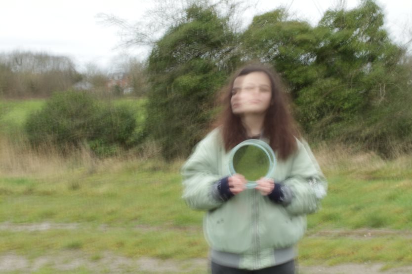
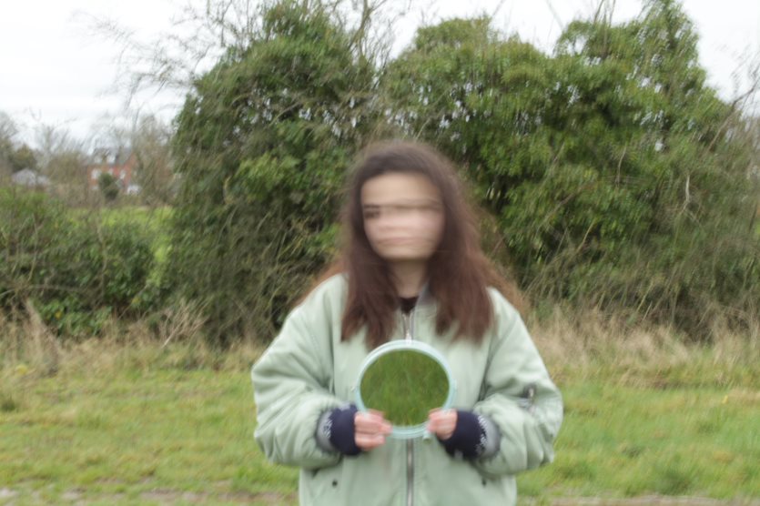
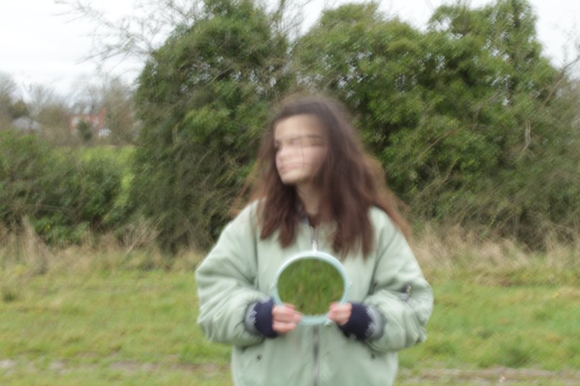
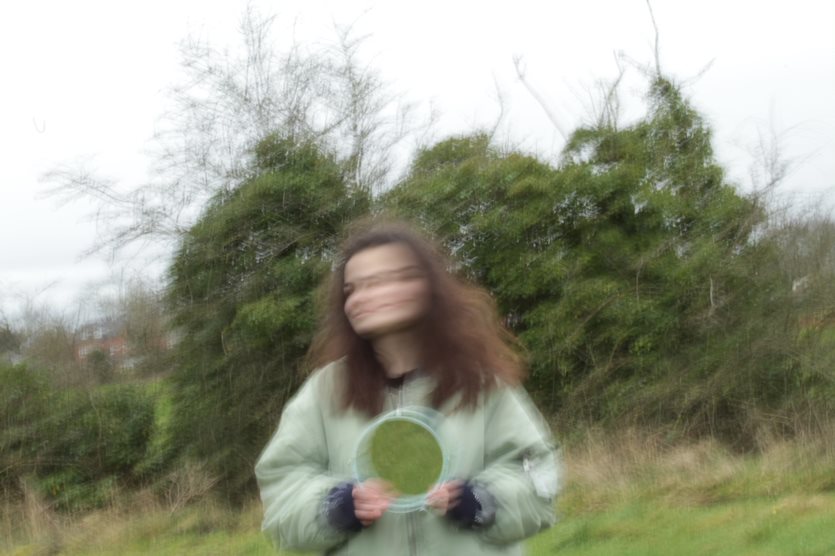
Laura is well-known for her wedding, family, and unique photography. She uses double exposure in her mirror images, which is when you take a picture of only the backdrop and then take another picture of the same background but with a person in it then you edit combining the images together and removing the top layer, giving a see-through affect.
As much as I love capturing our adventures and experiences, for the past decade I've captured so many memories for couples, families and businesses too. Laura Williams
|
Laura Williams first became known as a photographer at 18 when she was at college with a group of images she called 'Invisible'. The image that made her famous was the one to the right. I think this worked so well because her torso is completely removed, leaving her hands and head in mid air. The expression on her face creates a gothic feel, almost making her seem non-human. The whites of her eyes are eerie and complement the whiteness of her skin whilst the pose and naked flesh makes her seem vulnerable. Furthermore the background really works well. Williams has blurred the background, directing the the viewer's eyes to the subject. The continuation of the background in the mirror which is in the foreground creates an interesting perspective, making the viewer's gaze flit from the mirror to the background and to the model as they try to understand the image.
|
|
I've truly found my passion, creating a natural, authentic warm style encompassing clients thoughts, ideas and subconscious beauty. Laura Williams
Contact sheet:

Research and Investigation / Initial Images Student Choice
|
|
|
|
|

|
|
|
|
|
|
|
|
|
|
|
|
|
Research and Investigation / Best Edits Student Choice
|
|
|
|
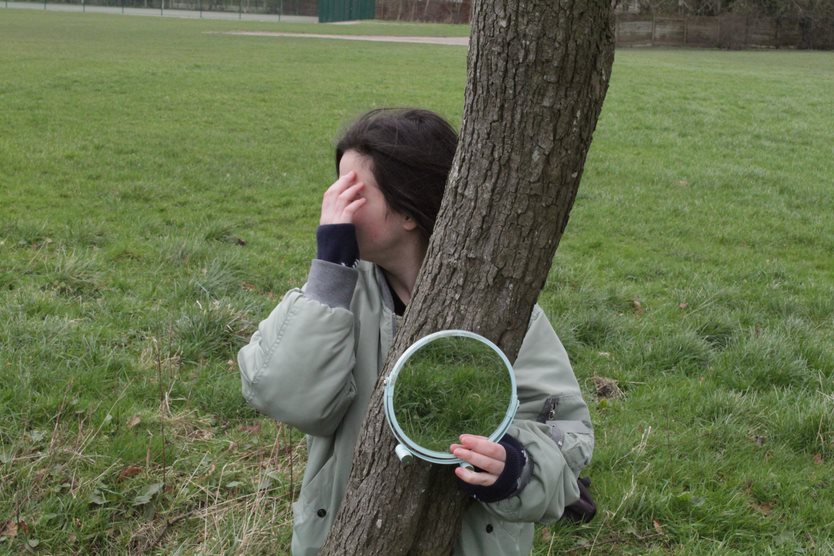
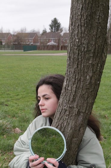
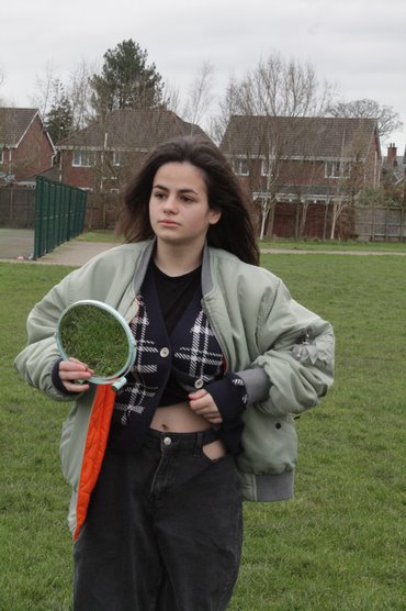
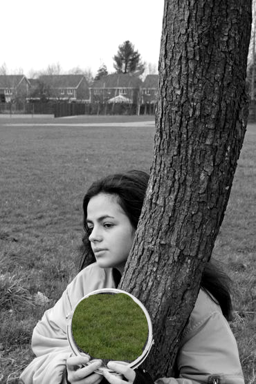
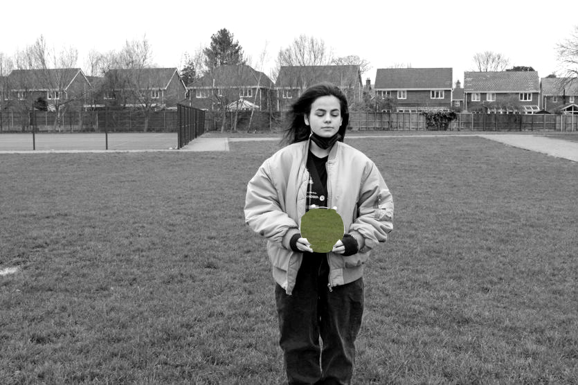
research and Investigation / Best Image Student Choice

|
The composition of the photo shows a tree slightly off centre and a mirror which guides the viewer’s attention downwards. However, the lines going down the centre of the image then lead your attention to the face which appears from behind the tree. The viewer’s eye is led finally to the background where the urban images contrast with the natural image of the tree in the foreground.
The perspective that I have taken the photo from is slightly above, allowing the viewer to look down upon the girl in the foreground. This makes the viewer feel the girl is more vulnerable or less significant. The tree is in front of the girl, and she is hugging it which gives the tree a powerful feel. The overall effect is to show the power of nature and our dependence upon it. The photo has been taken from a long distance, however I cropped it, so the subject of this image fills the frame. This focuses the viewer’s attention on the girl and the tree rather than other detail in the background such as the houses. Again this shows the power of the natural image of the tree over the urban area which is given a less significant position in the image. The photo has been taken outside using natural lighting which gives the image a more natural look, emphasising the power of nature. The light source is placed above which highlights the face. |
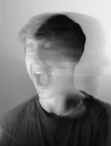
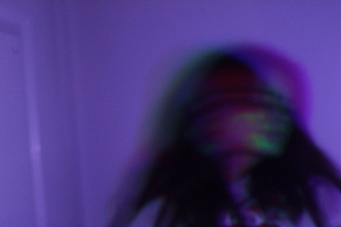
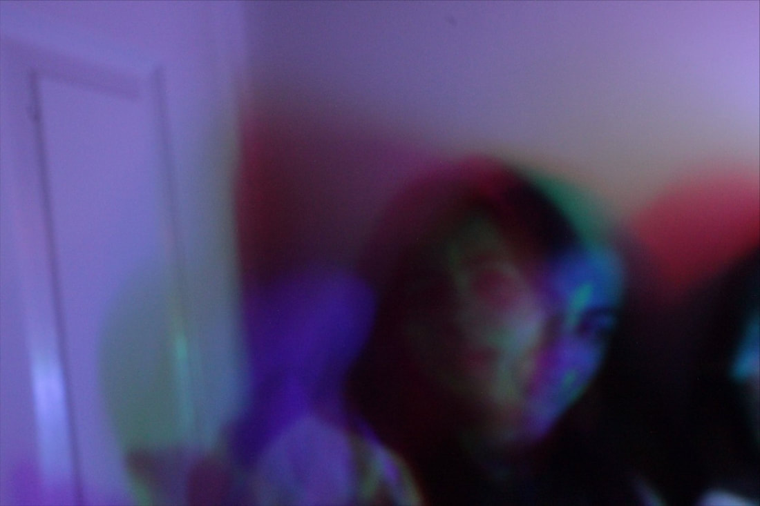
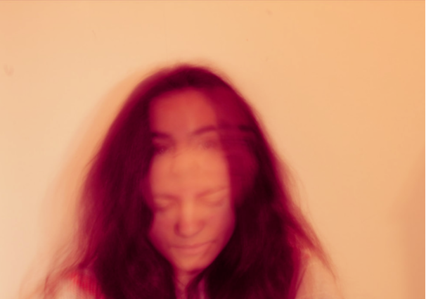
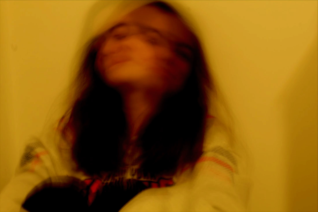
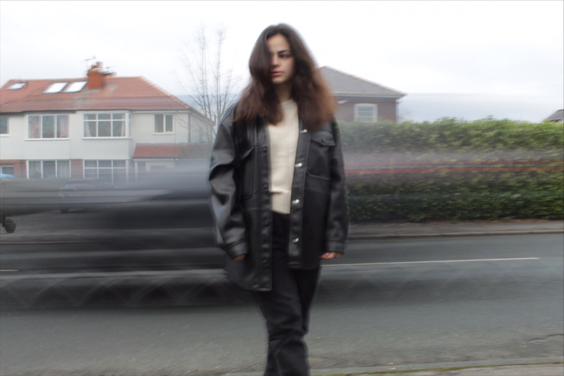
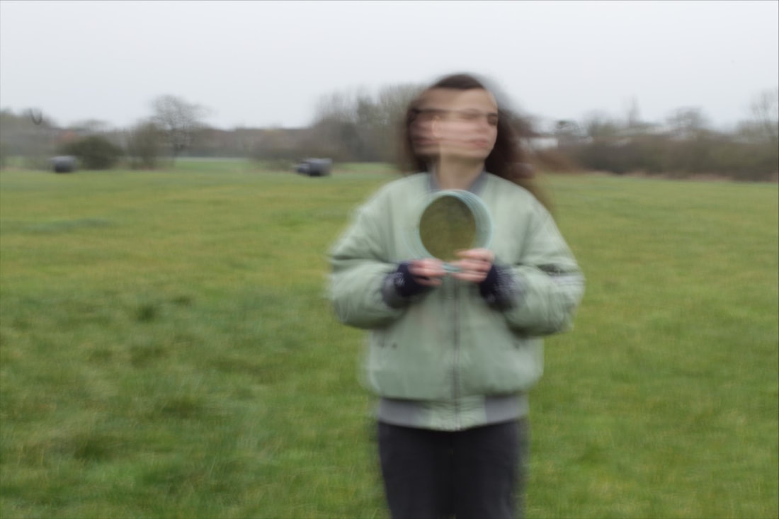
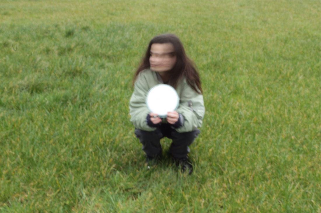
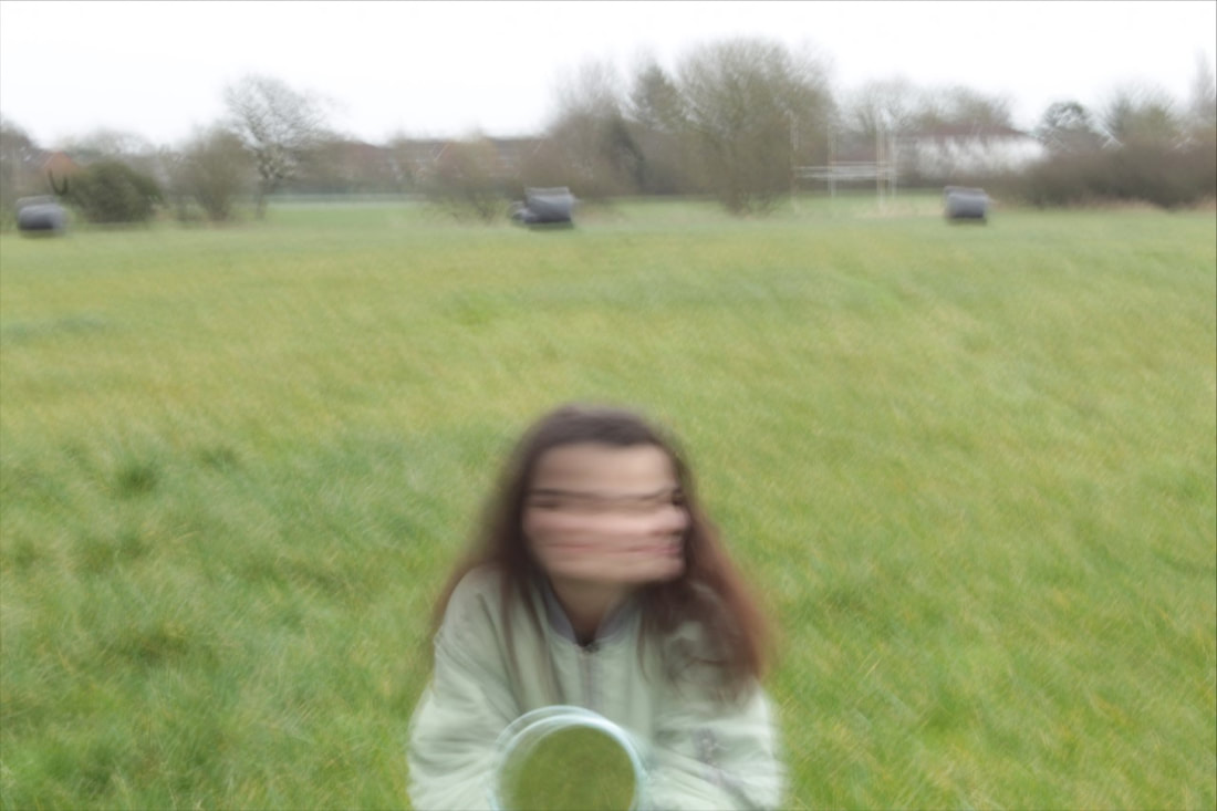
Shutter Speed Workshops / Long Exposure / Motion Blur / Light Drawing

Using a fast shutter speeds, like 1/250 second or faster is very good for capturing fast-moving subjects with minimal or no motion blur. Slower shutter speeds like 1/60 second and slower cause a blurring effect.
Slow Shutter Speed Portrait Examples - creates a sense of movement, blur or dynamic motion

|
|
|
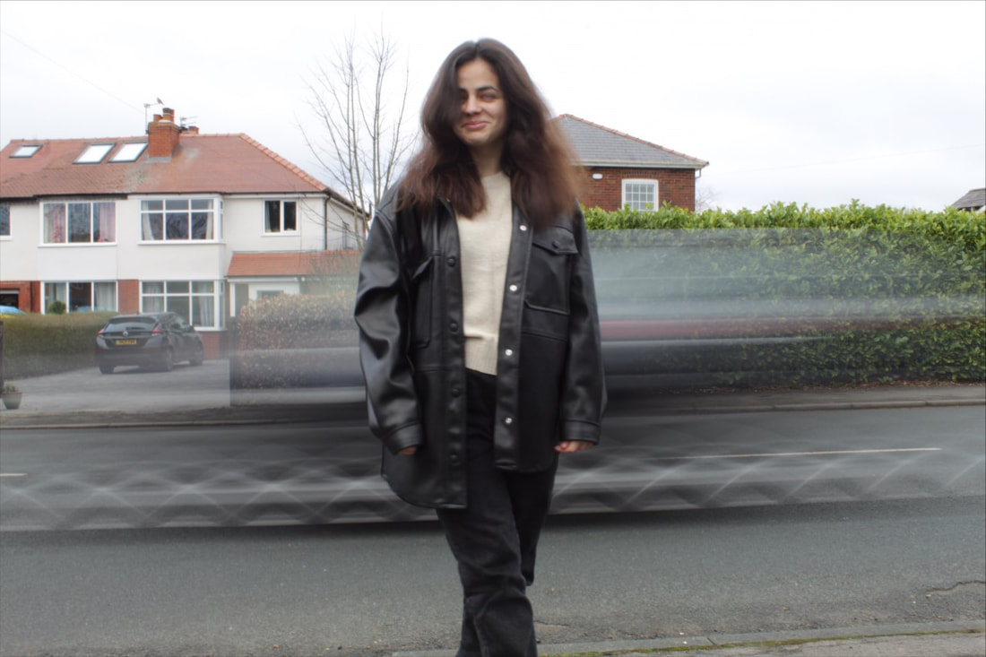
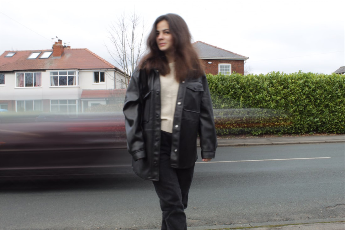
Fast Shutter Speed Portrait Examples - captures crisp details and freezes them in time

|

|

|
Photographic Techniques / Long Exposure
|
Long exposure means that the camera shutter remains open for a long period of time. The shutter opens for a fraction of a second in most cases which creates a ghost like affect Long exposures, on the other hand, might require the shutter to remain open for many seconds or even minutes.
|

Aperture f/14
Shutter Speed 3" (seconds) ISO 64 |
Aperture f/11
Shutter Speed 3 ISO 64 |
Aperture 14
Shutter Speed 3 ISO 64 |
Contact Sheet :

Photographic Techniques / Long Exposure / My Experiments
|
|

|
|
|
|

|
|

|
|
|
|
Photographic Techniques / Long Exposure / 4 Best Edited Images

|
|

|

|
Evaluation
|
The composition of this image shows one main focal point which uses the rule of thirds. Your eyes are drawn to the face of the model in order to draw attention to the model’s expression and lead them to wonder how she is feeling. The two images of the face suggest her feelings are mixed and that perhaps the feelings she is expressing may not be the same as the feelings she is keeping inside. The perspective of this image is eye level in order to focus the viewer’s attention directly on the model’s face, encouraging the viewer to explore the girl's emotions.
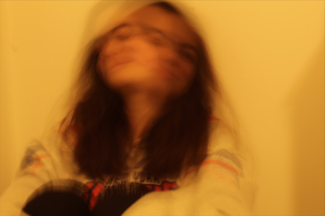
The image is taken from a short distance to ensure that you focus on the subject, encouraging the viewer to reflect on the model’s inner feelings. I used artificial light as the natural light was not strong enough to ensure that the facial expressions would be picked up sufficiently. The strength of this image was how effectively long exposure is used to blur the images of the girl together. This helps to convey the mixed emotions the model may be feeling, highlighting to the viewer that not only may a person be moving between emotions quite rapidly in a short space of time but also that the emotions they present to the world may be different from their inner emotions. The weakness of this image was the editing as I needed to erase some imperfections in the background. These imperfects could distract the viewer, causing them to lose focus on the model’s face and give them less opportunity to reflect on the feelings being expressed. I also think I could have added a filter to make a more chaotic atmosphere. Creating a more chaotic feel to the image would help to highlight the mixed emotions the girl may be feeling inside and the possible juxtaposition between the emotions present externally and internally. However, overall, I feel this image successfully encourages the viewer to reflect on the complexities of emotions but it could have been improved with the use of a filter and by removing imperfections. |

|
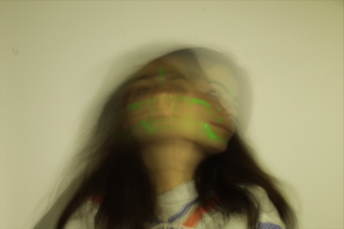
This image uses similar effects to the image above, yet this image creates a different emotion - hope. The way the person is firstly looking down suggest a sense of inner sadness. However, when they look up, I was looking for the model to convey a feeling of new ambition, and a sense of purpose which all leads to a sense of hope. This image is taken from a short distance to capture the main focal point of the girl using artificial light to uncover more of the girl’s facial expressions in order to help the viewer reflect on the model’s inner feelings.
The strength of this image is it is very clear making it easier to see the different faces. This makes it easier for the viewer to see the model’s expressions, giving greater insight into her feelings. The weakness in this image is that the face looking down is more visible. This makes the viewer focus on the feelings associated with this image - loss of control or doubt, rather than the feelings of hope associated with the image of the model looking up. This shift in focus was not intended. In order to convey the more positive emotion, I would need to increase the strength of the second image, giving it greater definition. Overall, I think this image was successful as it gives the viewer gives a glimpse at how the model may be feeling at that moment in time, even though it focuses on the more negative emotions. However, I prefer the edited version as the pink highlights give a more positive feel to the image, perhaps making the model appear to be feeling more positive for example, more hopeful rather than feeling self-doubt. This is because the colour pink is a warm colour that juxtaposes the looking down image of the model. |

|
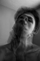
The composition of this image is slightly off centre to symbolize imperfection that lies within the girl. The perspective this was taken was at eye level which is effective because the expression of the model’s face in both images is fairly clear. I used black and white to create different tones. The dark tones in her face defines her facial features as they contrast the light areas. This helps to put across her emotions more effectively.
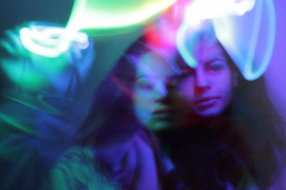
The strength of the second image is the lighting and how it reflects the emotions of the person’s feelings. The green hues are reflected in the face of one of the images whereas purple is reflected in the other. This helps the viewer reflect on the mixed feelings of the model, perhaps even suggesting a split personality or the juxtaposition of the girl’s inner feelings against the feelings she shows to the world. There is are different shades of colour of the image as a whole which reflects the richness in the range of emotions a person may experience. A weakness of the first image is that it appears too faded. This was not the effect I had planned for as it makes the expressions on the face difficult to see and therefore interpret. The overall effect would be unlikely to catch the eye of the viewer as the image is unclear. On the other hand, the image looks unique which may appeal to viewers. The unclear image, may encourage viewers to pause and look for detail in the photograph in a way they do not in the more colourful, aesthetically pleasing image. |
|
The composition of this image shows a girl in the centre where the rule of thirds has been used. The background is blurred and is free of distractions, and the dark image of the girl contrasts against the pale background, drawing the viewer’s eyes to the girl’s face. Initially, the viewer may feel there is just one face in the centre. However, as they look more closely their eyes are led to the left and right as they pick out the two images. The photo has been taken from a short distance so that the main focal point is the girl. The girl has been placed in the foreground. By doing this, the viewer’s eyes are led directly to the centre of the image.
The photo has been taken using artificial light. The light is placed above which is highlighting the face and the face paint, making it stand out. This creates a ghostly atmosphere because it creates shadows, giving the image a more sinister feel. The face paints create another layer that subtly contrasts against the skin tones of the girl. This may give a more skeletal feel to the image, highlighting the emotions the girl may be feeling inside. On the other hand, the layers in the image may reflect the layers of emotion a person may be feeling at one time. The second image I feel was less successful. The dark tones and the highlights make it difficult for the viewer to pick out the detail in the girl's face and actually seem to distort her features. Her white eyes, for example, make the pupils stand out, giving her an almost out of this world feel. The light areas are too bright, making the image appear too exposed and the detail of her hair is completely lost. The strengths of this shoot are the transition between the faces and the fact that the image appears symmetrical. However, I feel there are still areas to improve. For example, when editing, I could have flipped the image to make a pattern which would have been interesting. The pattern could have created more layers for the viewer to explore, reflecting the complexities of emotion or the fact a person can present many personalities to the world. Furthermore, I believe this is a successful use of motion blur which helps to blend the image and remove distractions in the background, allowing the viewer to focus on the girl. |
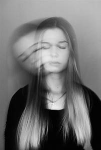
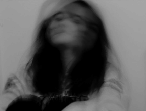
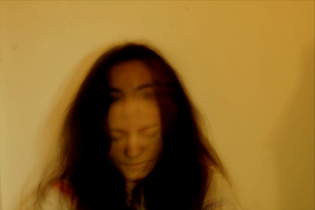
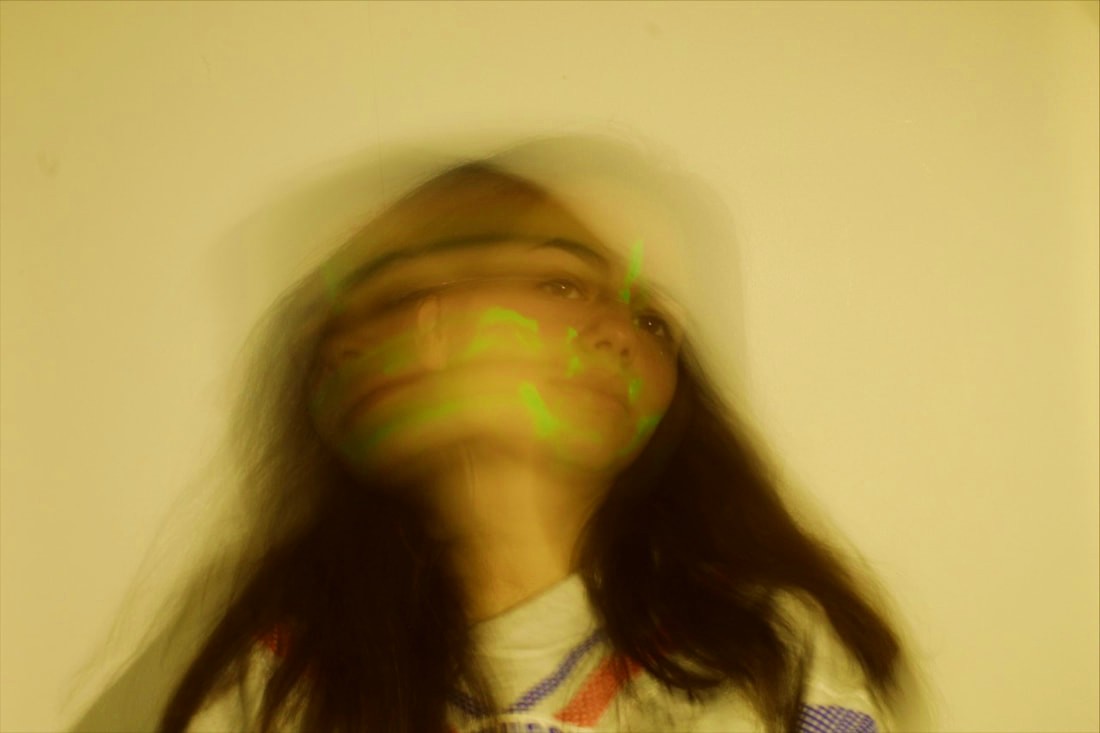
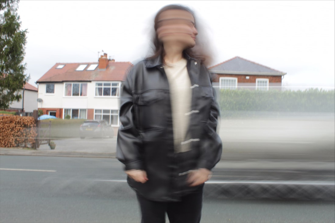
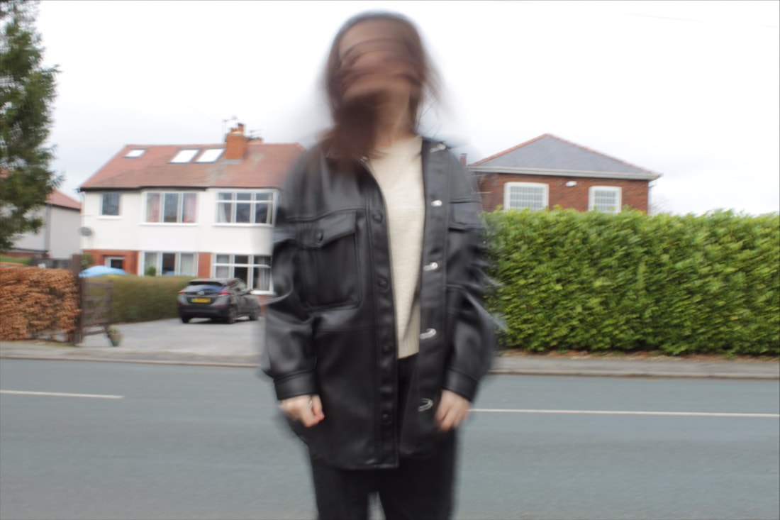
Motion Blur
|
Motion blur is the capturing in a photograph of the purposeful streaking or blurring of an object in motion in order to enhance the motion of the image. A photograph is a still image and yet this visual technique creates movement in the frame. This technique is therefore often used in both nature photography and sports photography.
|

|

|

|
Photographic Techniques / Motion Blur / My Experiments
|
|
|
|
|
|
|
|
|
|
|
|
|
|
|
|
|
|
|
|
|
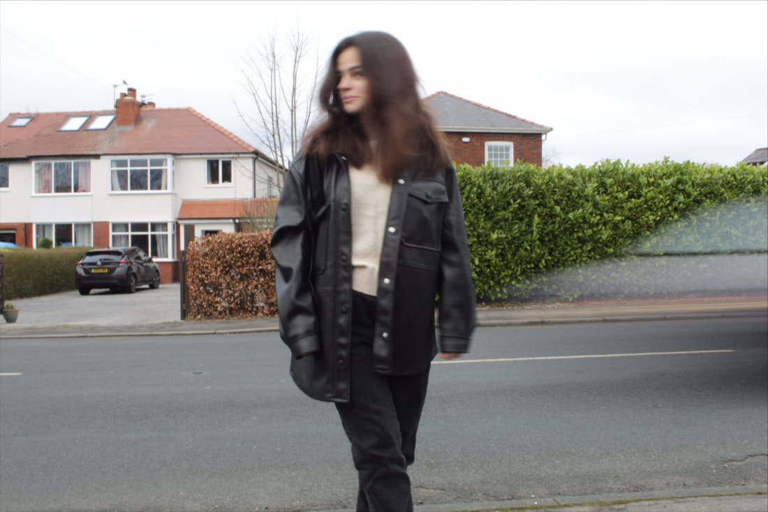
Photographic Techniques / Motion Blur / 4 Best Edited Images
|

|
|

|
Evaluation

|
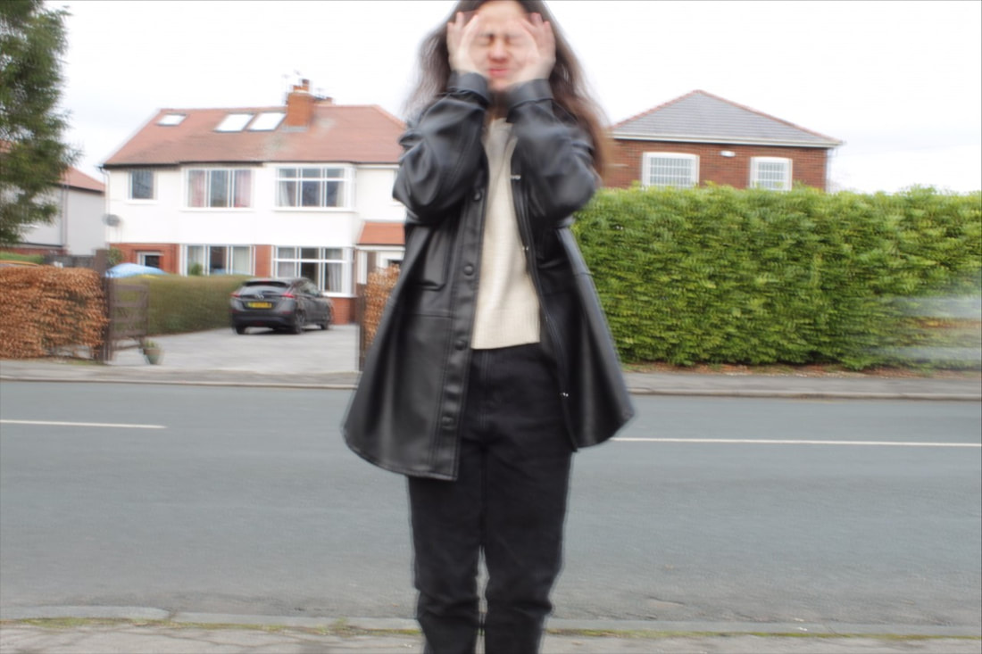
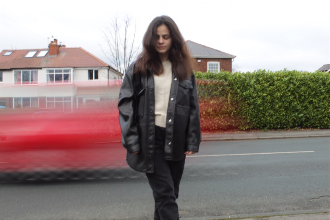
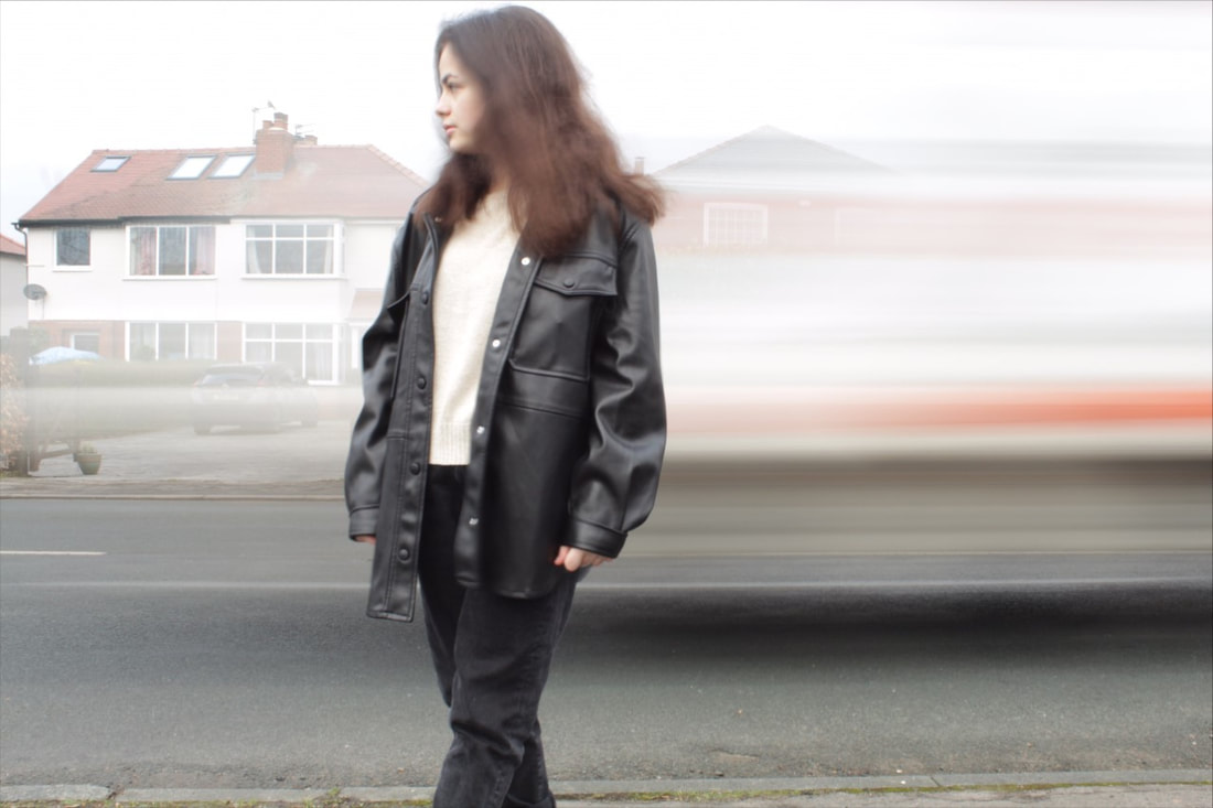
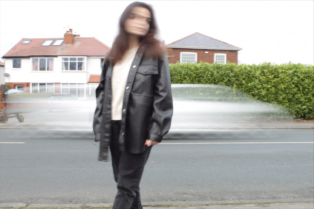
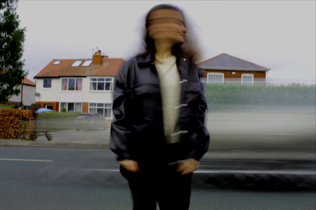
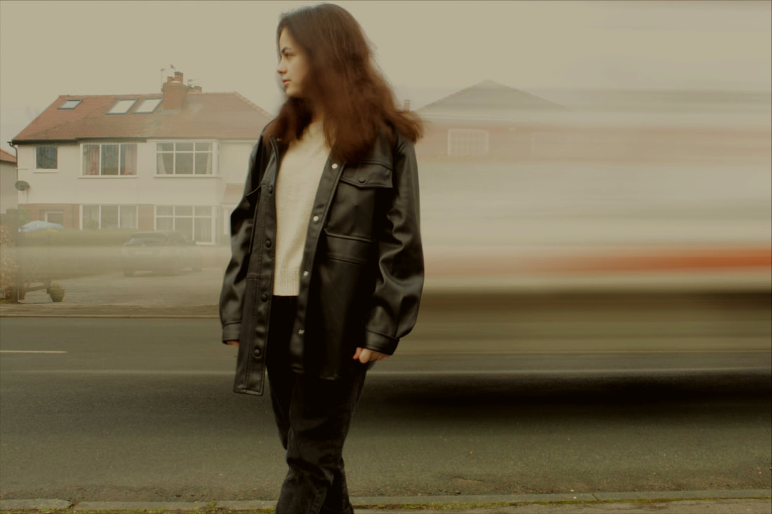
The composition of the photo shows a car driving past in the midground. Then the buildings behind are in the background and finally, the girl is in the foreground. The viewer’s eye is initially drawn to the girl’s face, only to discover it is in fact two images blended together. This causes the viewer’s eyes to flick left and right as they try to interpret the overall image. The girl’s body contrasts with the background giving a surreal effect as if she has been superimposed on the photograph. The viewer’s attention is then drawn to the blurred image of the car which juxtaposes against the stillness of the girl. This again gives a surreal feel to the overall image. The image is taken at eye level, focusing the viewer’s attention on the girl’s face.
The photo has been taken from a long distance, so it was able to pick up everything in the background as well as ensuring that the person remained the main focal point of the image. As the buildings are still detailed, once the viewer has focused on the girl and then the car, their attention is turned to the buildings, leading them to explore the connection between the girl and her environment. The photo has been taken outside using natural lighting. The light source is placed above which is creates shadows on the girl’s face and grey tones. This creates a cold and melancholy atmosphere which is reinforced by the surreal feel of the photograph. Overall, this was a successful shoot using motion blur as a visual effect. The strength in this image was how the girl’s head and the car were affected by motion blur. It gives the impression of a fast-moving moment frozen in time, which contrasts with the stillness of the background and the girl’s body. This gives the appearance of the girl feeling removed from her environment as if she is caught up in the emotions she is feeling within. The blurring of her head suggest these emotions are complex and confusing and perhaps overwhelming. However, on the other hand, the image looks edited which may lead the viewer to believe the girl’s emotions are superficial or not real. |

|
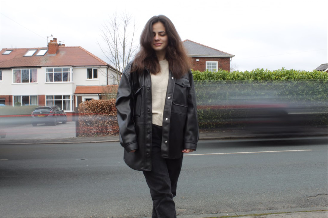
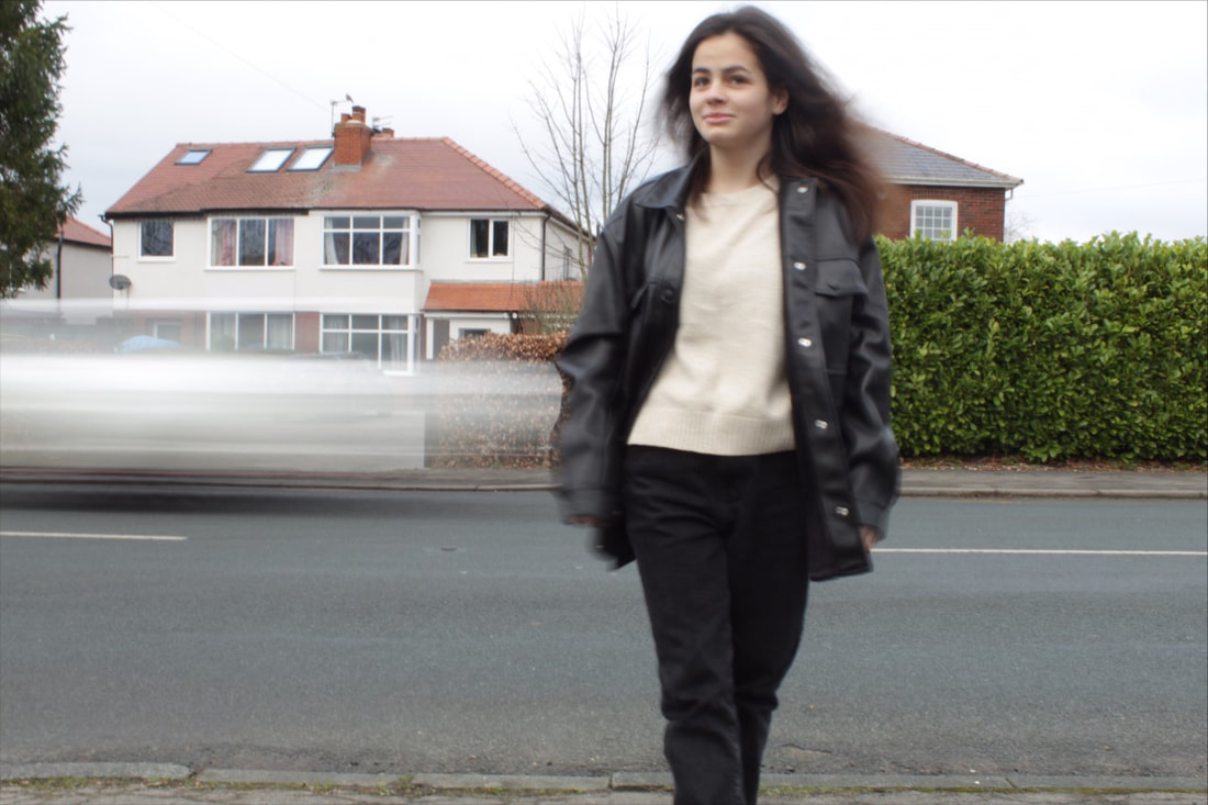
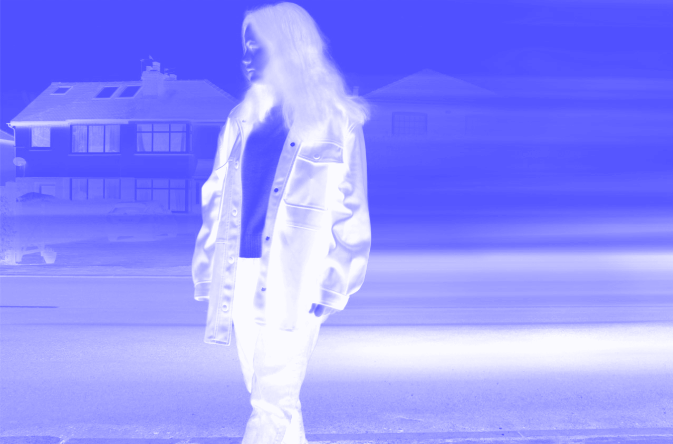
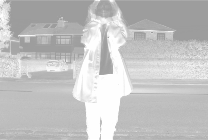
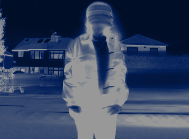
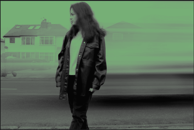
The composition of the photo shows a girl standing on the pavement while cars drive past. As the photograph is taken at eye level the viewer’s attention is initially drawn to the girl, before moving to the background. The car driving past is blurred and blends into the houses and the sky. I feel this is something I would like to change as it is difficult for the viewer to recognise the blurred image as a car. It could suggest to the viewer the photograph was captured on a misty day rather than that a car was driving past. The image of the girl is clearer than the one above, encouraging the viewer to reflect on why the girl is looking to her right. It is as if something has captured her attention. Whereas in the photograph above, the person appears to be focused on their own inner emotions; in this image the girl is more connected to her environment and not focused on herself. This gives the impression the girl is in a more settled state of mind. I think it would have been interesting to take this picture from worm view so that the viewer looks up to the girl. This would make the girl appear more powerful and in control as if the viewer is looking to the girl to find answers. The photo has been taken outside using natural lighting, giving the image a natural feel. The image, therefore, has a more realistic appearance than the one above, reflecting her composed appearance and her attention on the object to her right. The light source is placed above, creating shadows on the person’s jacket, giving it a soft, fluid appearance. This reflects the calm outlook of the girl and helps to create a powerful, strong atmosphere. Exploring with colour filters gave me the opportunity to look at how the colour changed the atmosphere. In the first image, the purple hues contrast with the light tones of the girl. This almost appears as if the photograph was captured with a thermal imaging camera. The girl’s attention is less clear and therefore the viewer is drawn more to the girl’s hair and jacket rather than her focus. This means the viewer is less drawn to the girl’s emotions. Furthermore, the image of the car is lost from the image which focuses the viewer’s attention on the girl. In the second image, the green hues remove the car from the image completely and creates a more eerie feel to the photograph. The girl’s facial expressions are clearer, allowing the viewer to follow the girl’s gaze and reflect on what she is looking at and her feelings within. |
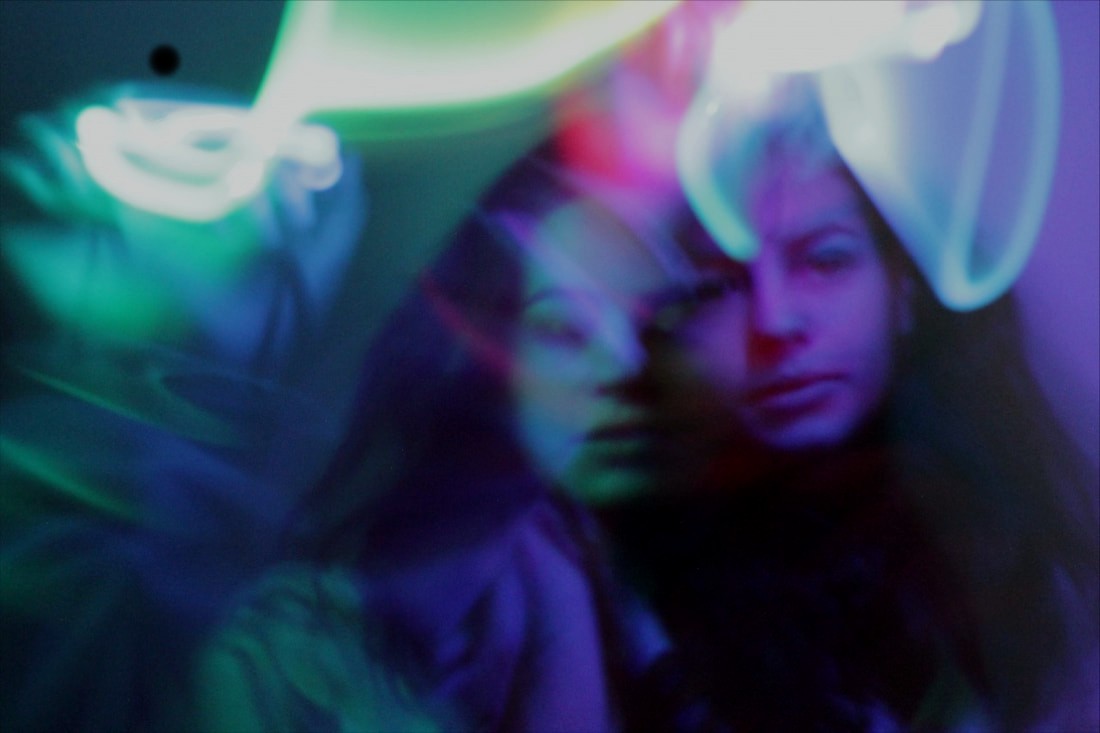
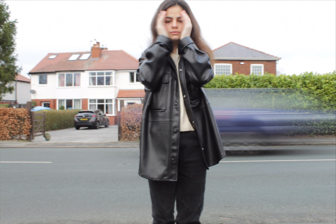
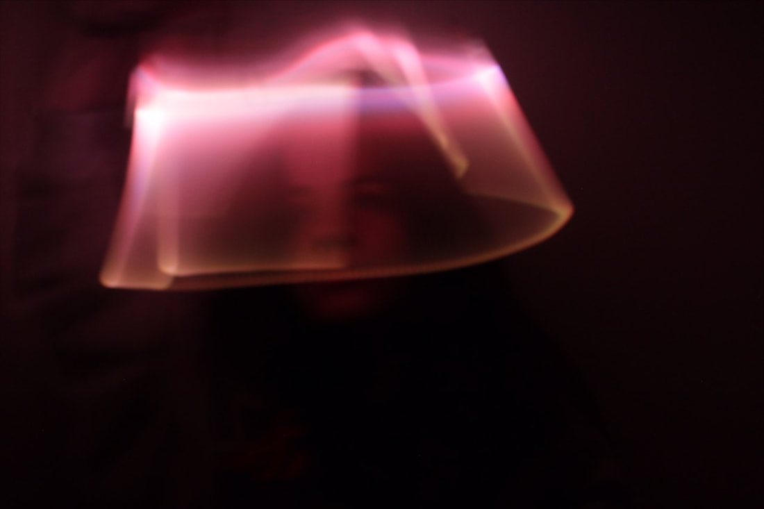
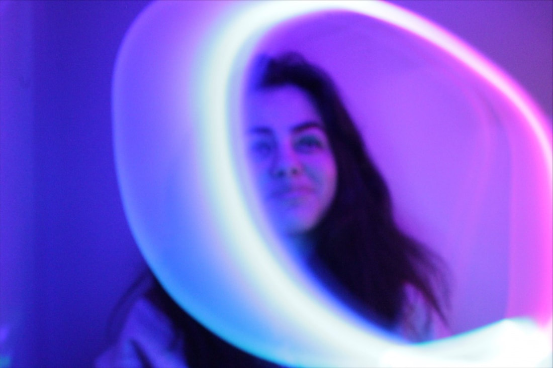
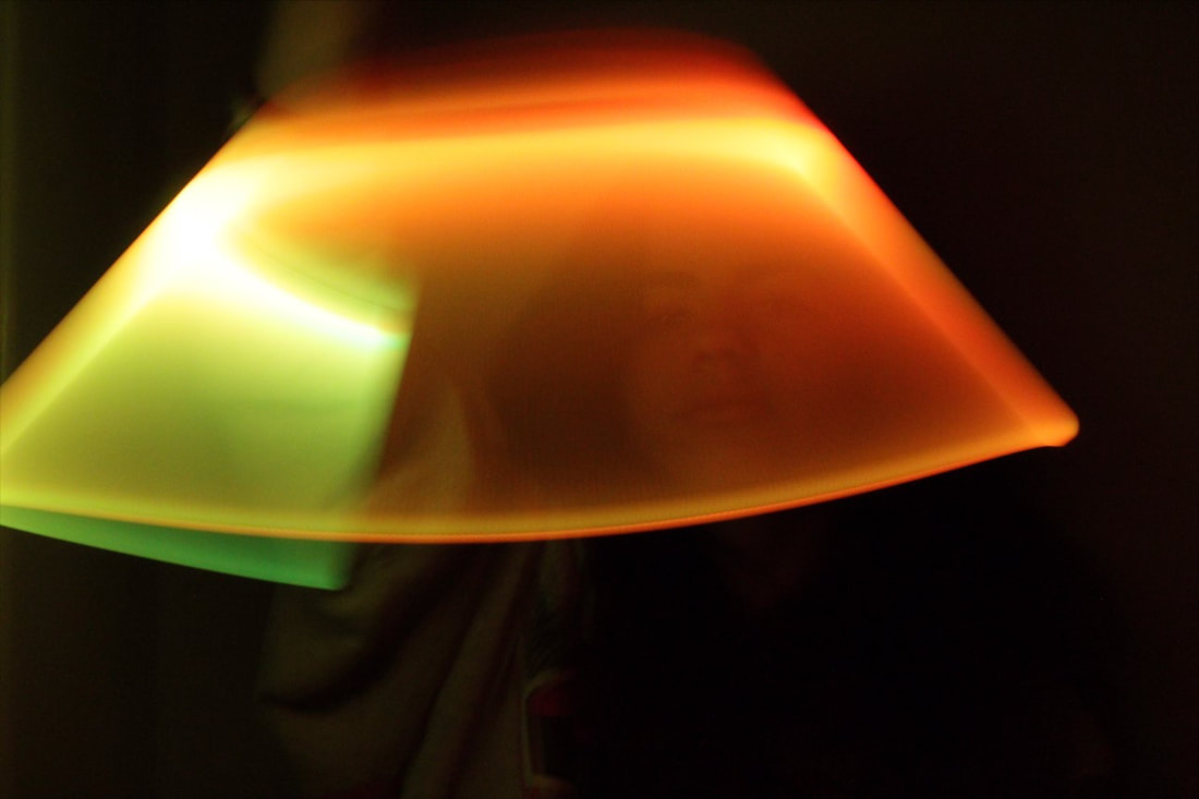
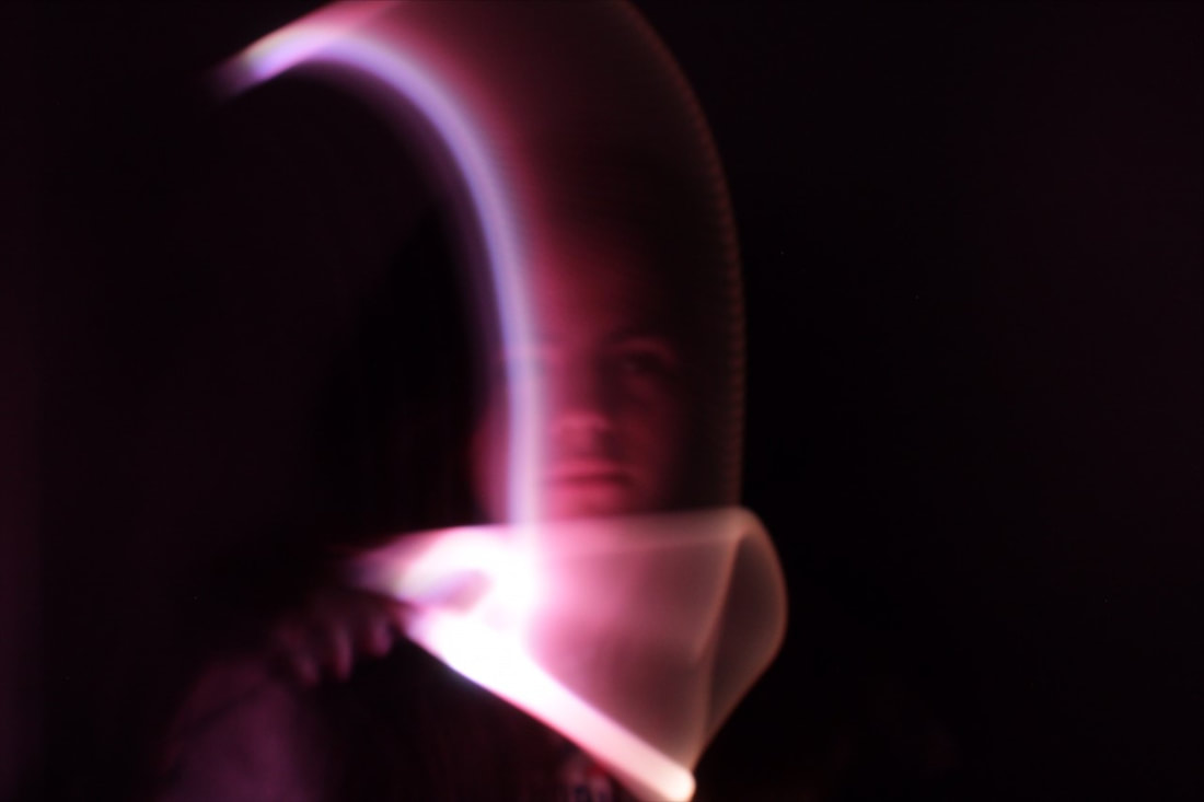
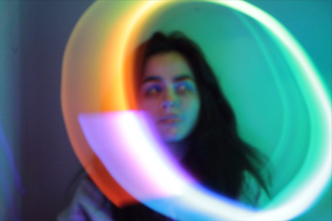
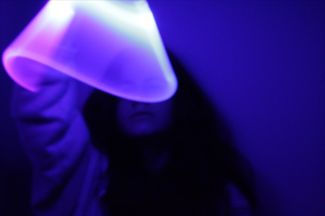
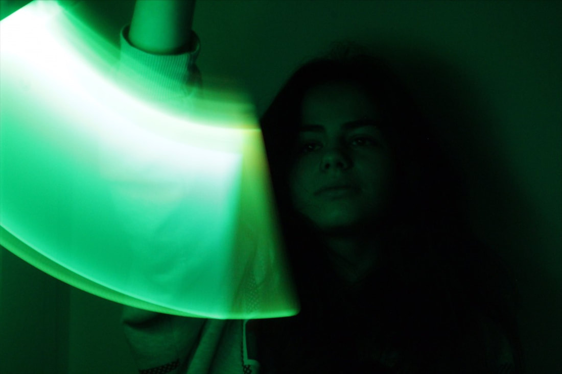
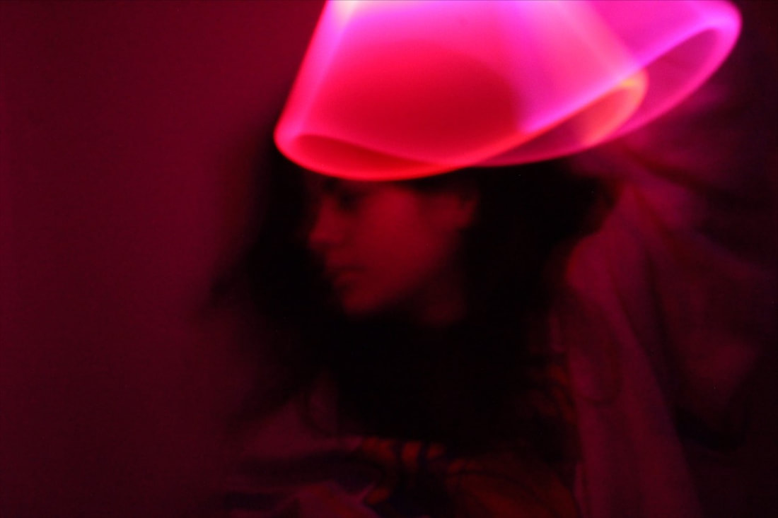
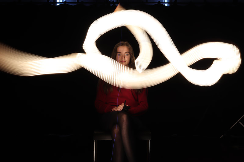
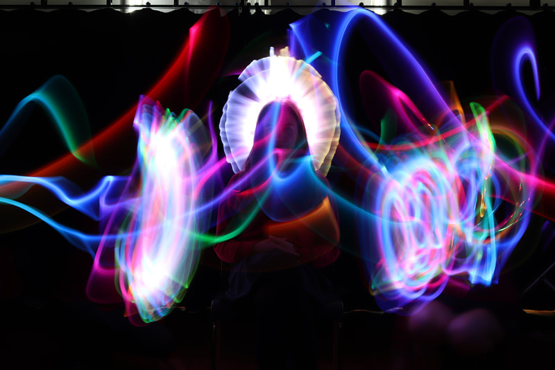
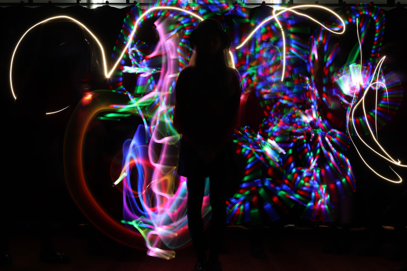
Photographic Techniques / Light Drawing

|
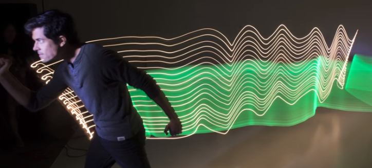
Sometimes called light drawing or light graffiti, light painting is the photographic technique of using a moving light source—such as a flashlight, glow stick, light brush, or even a smartphone—to alter an image while taking a long exposure photograph.
|
|
|

|

Contact Sheet:

|

|
Photographic Techniques / Light Drawing / My Experiments

|
|
|
|
|
|

|
|
|
|

|
|
|
|
|
|
|
|
|
|
|
Photographic Techniques / Light Drawing / 4 Best Edited Images
|
|
|
|
Evaluation


|
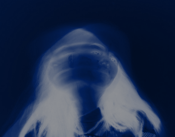
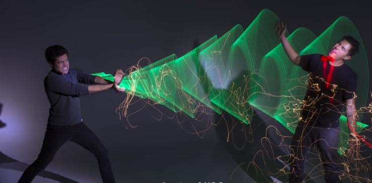
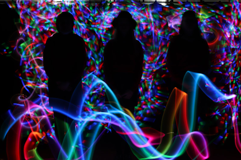
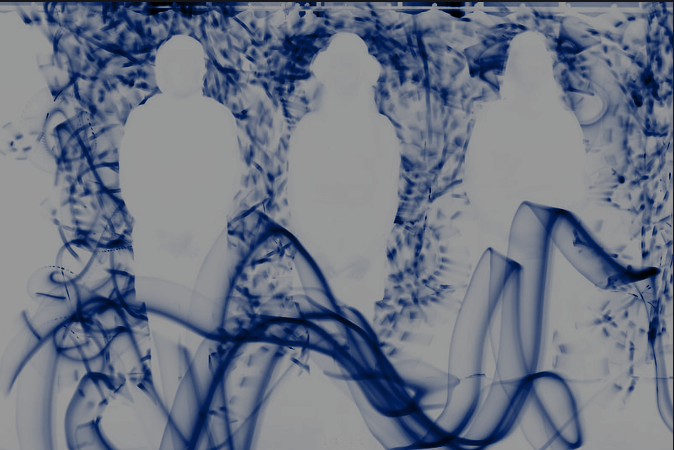
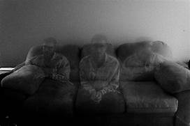
This image depicts 3 people in the shadows. The silhouette of the three people creates an atmosphere of mystery as the detail on the figures cannot be seen. The upright straight and evenly spaced figures creates seriousness in the image. It is as if the figures' attention is directed on the viewer and yet the viewer is unable to make them out, creating a slightly ominous feel.
The composition of the photo shows 3 people standing even distances apart in the background, using the rule of thirds. This creates an evenness to the image, making it more striking and enhancing the ominous feel. The viewer’s eye is first led to the three figures as the photograph is taken at eye level, before moving to the bright lines to the foreground and then to the chaotic maze of colours in the background. The juxtaposition of the bright chaotic background and foreground against the still silhouettes highlights the slightly threatening feel, creating a dynamic photograph. The photo has been taken from a long distance so that the image could capture everything, ensuring the 3 people are the main focal points of the image. The people have been placed in the background which leads the viewers to initially focus on the back of the image which again creates a feel of slight unease about the figures. It has been taken inside using artificial lighting with the light source placed all around the image. This helps to create a uniform appearance in both the background and foreground, giving a slightly futuristic or ‘science fiction’ feel to the image. Overall, I think this was successful. This is because of the way the light is all around them and it looks like it's consuming them. I improved the vibrancy and contrast in this image, as well as accentuating areas of light to increase the contrast between the figures and the rest of the image. I also lowered the exposure to make some spots of light stand out more than others. All of these adjustments reinforced the ominous feel of the image. |

|
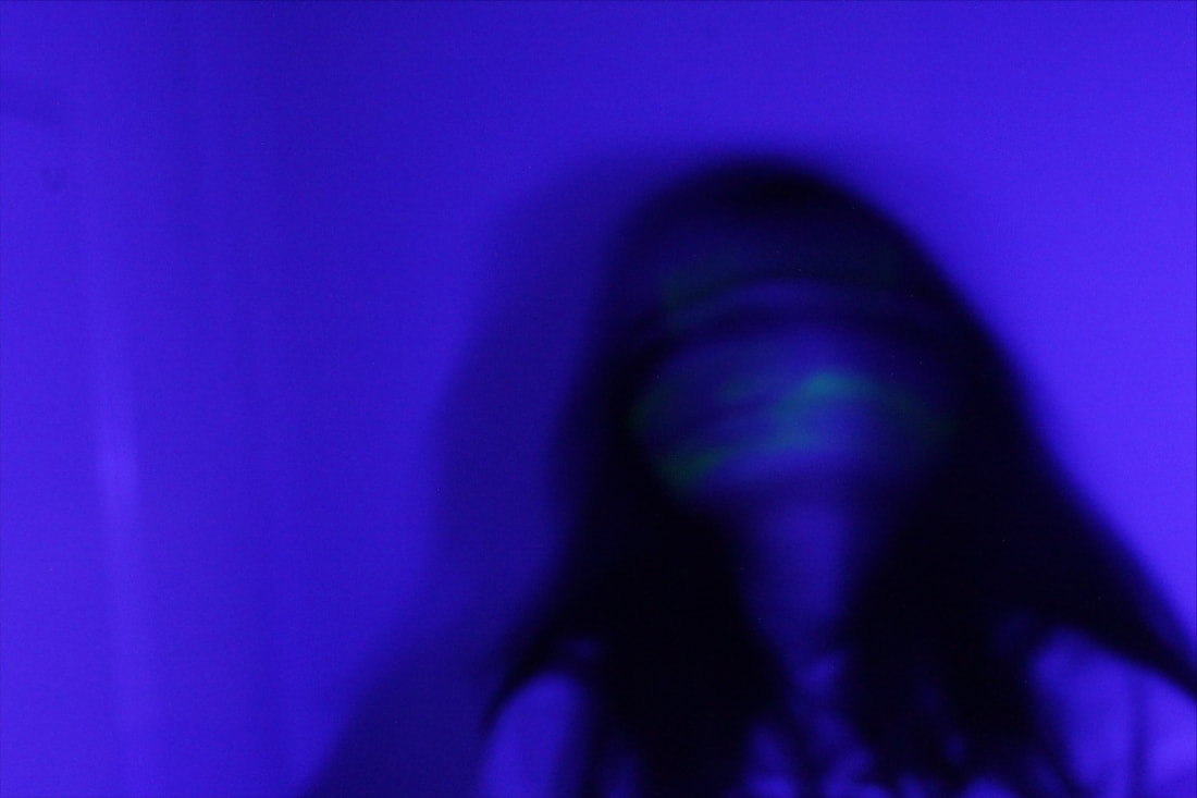
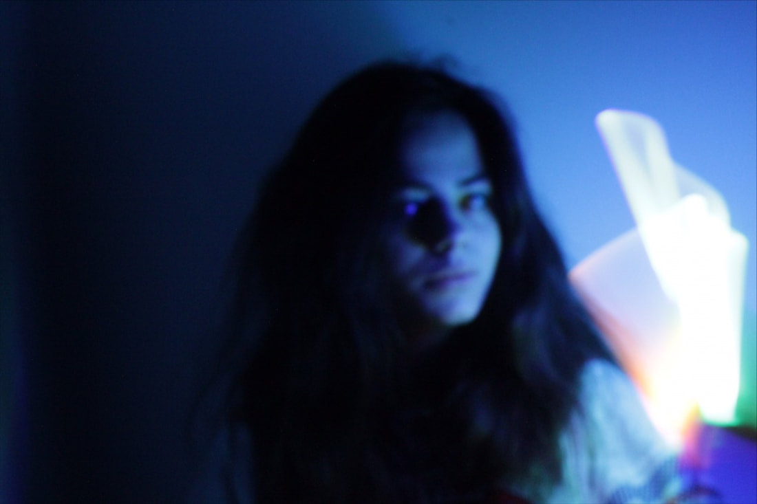
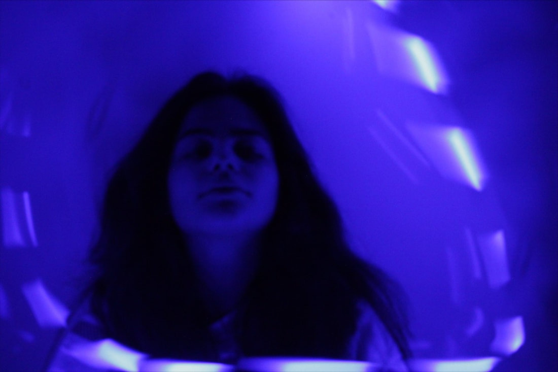
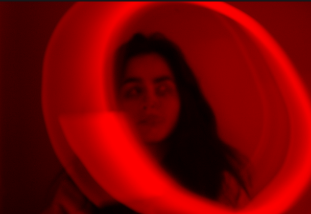
The perspective that I have taken the photo from is eye level so that the viewer looks at the subject directly. The photo has been taken from a short distance so so that the main subject is the girl. The photo has been taken inside using artificial lighting with the light source placed above the subject which creates depth and shadows. This creates an atmosphere because of the contrast of colour. However, the lighting was insufficient to light up the girl. therefore the focus is on the pink effect in the foreground. The viewer has to hunt for the image of the girl, who blends in with the background. The second image with the blue hues is more effective as the girl can be seen a little more clearly. However, the girl is still not the main focus of the viewer.
The colour difference between the two images is interesting as they each create a different atmosphere. Pink is a warm colour but combined with the dark tones in the background, it creates a slightly sinister feel. Perhaps reinforced by the girl's lack of expression and the fact she is looking away from the camera. The blue tones in the second image create a cold feel, giving the impression she is outdoors. The girl appears further away in this image than in the previous. This makes the girl seem like a more unreachable figure to the viewer. Despite, not getting girl as the main focus of the image, I thought this was an interesting exercise and allowed me to explore the effect of colour. |
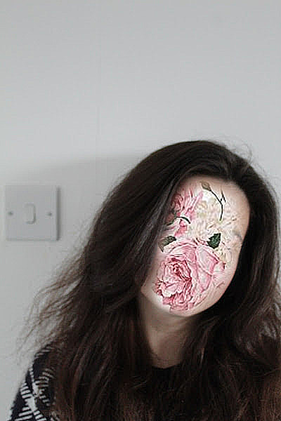
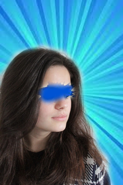
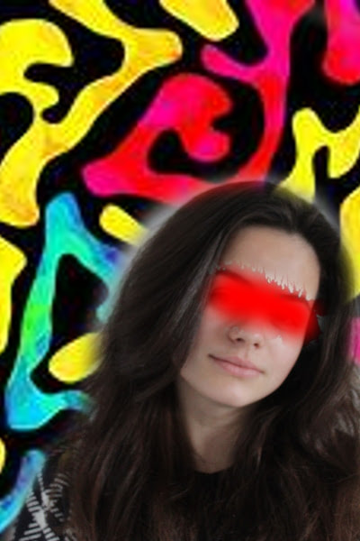
Artist Investigation /Pablo THECUADRO:
|
|

|
|
|
|

|

|
|
|
|
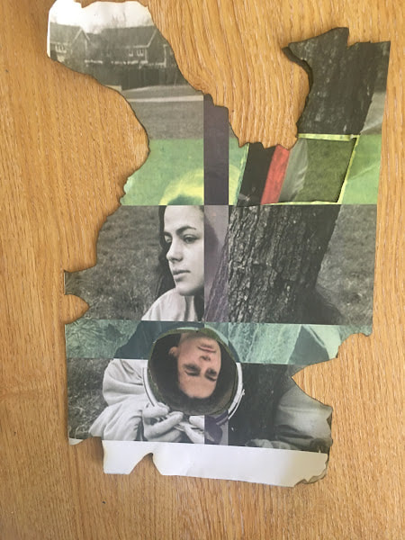
“The collages I make express the duality in the human being, who we want to be versus who we really are and what part of us we show to others. Collage art is a never ending process, you can put as many images you want together over and over again.“ Pablo Thecuadro
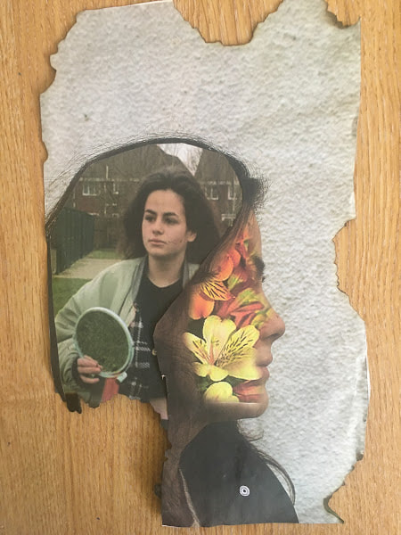
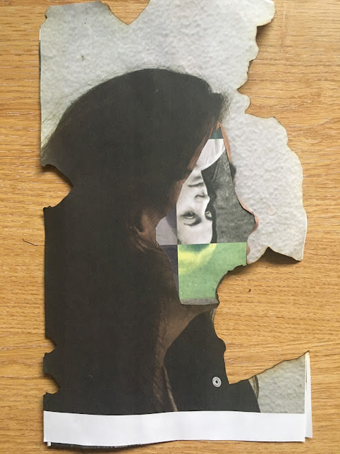
Pablo Thecuadro was born in Zaragoza, Spain in 1992. He is a photographer and collage artist. In his work he tries to show more than one side of people: who people are, who they want to be and how they present themselves to the world. He takes photographs of fashion or uses fashion editorials to select images and uses them to make collages and present something new. He transforms images both digitally and manually, challenging people's ideas of human beings. To emulate Thecuadro's work at home, I’d first print out some of my best images that try to show interesting views about people either by what they are wearing or by their expressions. I will then aim to cut them up and rearrange them to create a new image. I will aim to create a new atmosphere or mood. |
YouTube

website:
|
|
|
|
|
Composition Design 1
The aim of my shoot is to produce a unique image relating to the theme of portrait and identity. I wish to express the emotions of joy and happiness through the use of vibrant light colours and uplifting images. I am particularly interested in selecting images to arrange into layers, revealing further meaning. I'm am going to base my photoshoot on the Motion Blur topic, combined with Denis Sheckler's work to create an individual, unique piece by layering different images from each. I want the model to evoke happy emotions.

|

|
|

|

|

|
|
|
Shoot Plan:
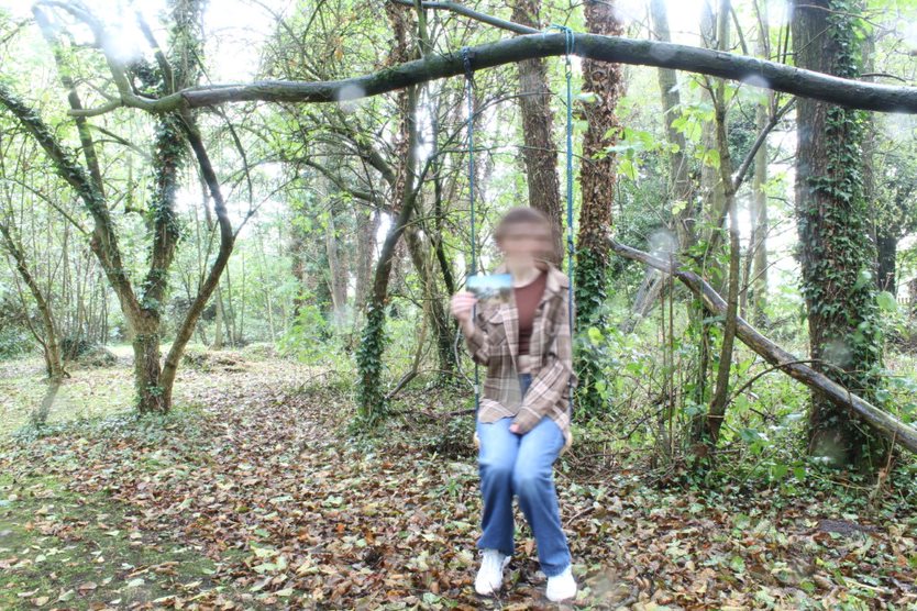
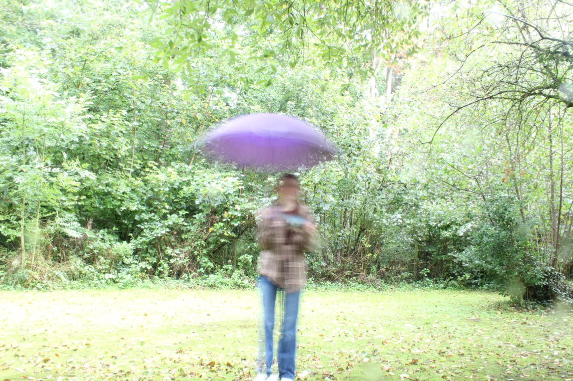
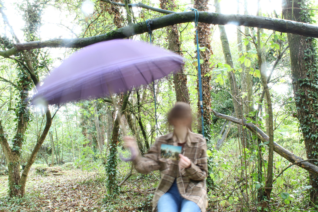
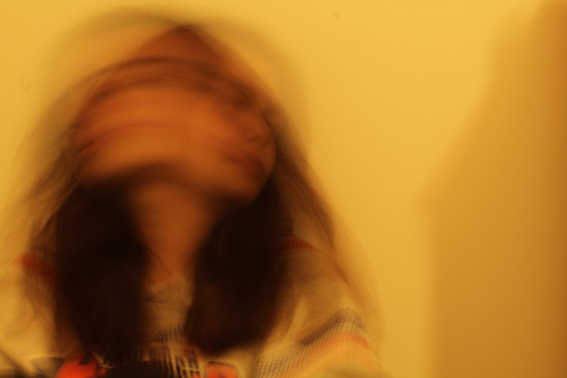
For my shoot, I will use a female model. I will then get her to shake her head to create a motion blur effect. The image will then need to be edited, to replace sections of her body with colourful light which will be further convey happy emotions. To physically edit it, I'd use a sewing machine to further express that colours are exploding out of her. I have drawn inspiration from Denis Sheckler and motion blur because I feel like it would convey a mysterious but cheery theme to my final piece. I plan for the shoot to take place outside, in dense woods because I want to imply that the girl is lighting up a dark, scary place. The aim will be to explore the contrast of the girl's innocence with the dark imagery of the wood. I intend to shoot with Canon ND60000 using lens on a tripod to help keep the camera still whilst I take the picture. When considering exposure, I intend to shoot with a slow shutter speed of 1/30 to create intentional motion blur. Also I intend to shoot with a small aperture f/22 for large DOF. |
|
Shoot

|

|

|
These photos did not turn out as i hoped, consequently i will now use the images I took earlier for my final piece

|

|
|

|
|

|

|
|
Editing Process
Best Edits:
|
|
|
|
|
|
Final Outcome

|

|
Composition Design 2:
initial inspiration:

|

|

|

|

|

|

|

|
|
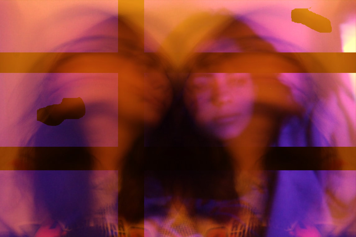
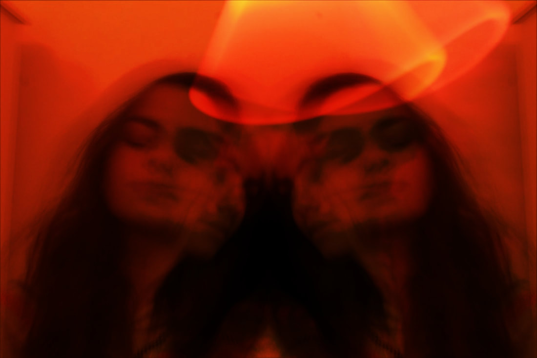
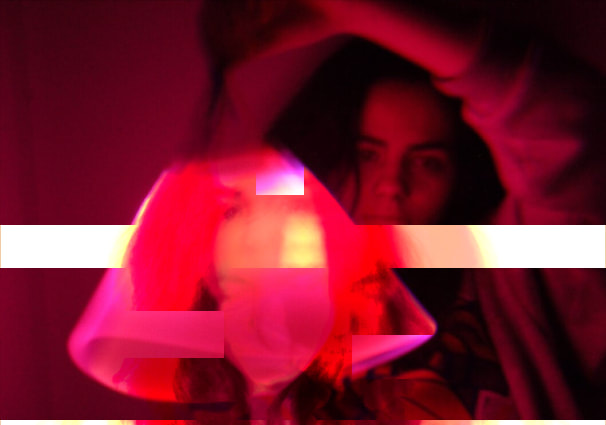
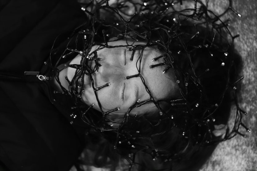
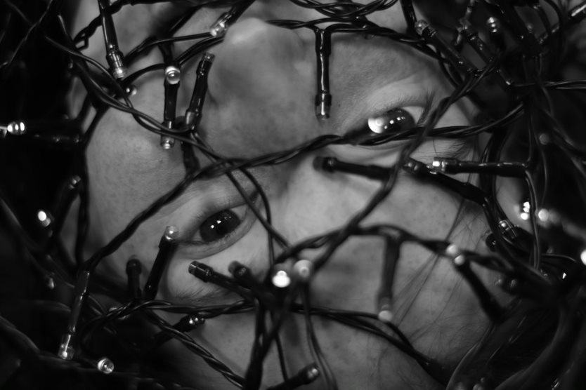
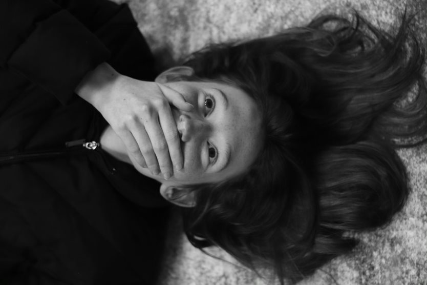
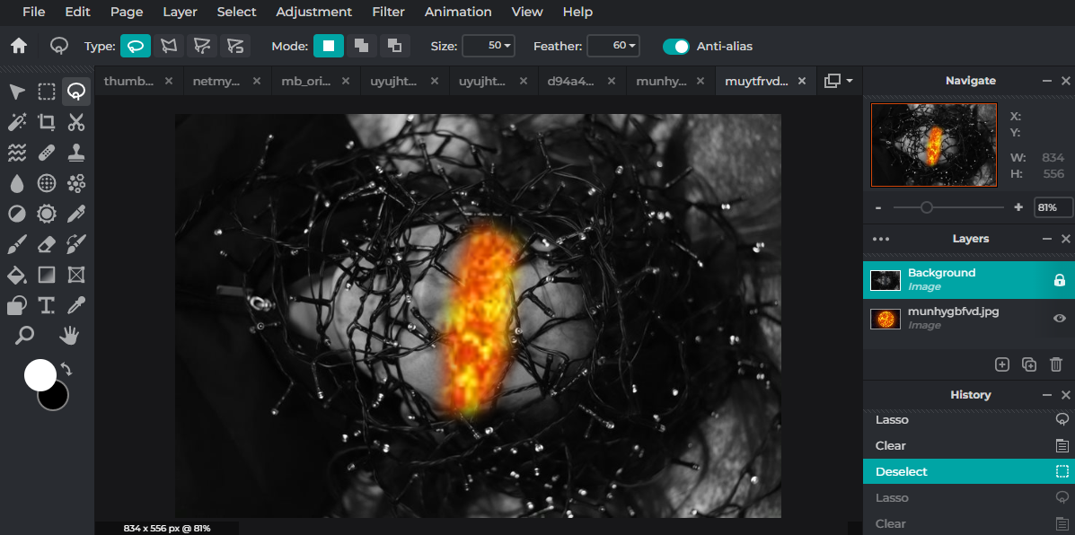
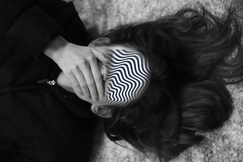
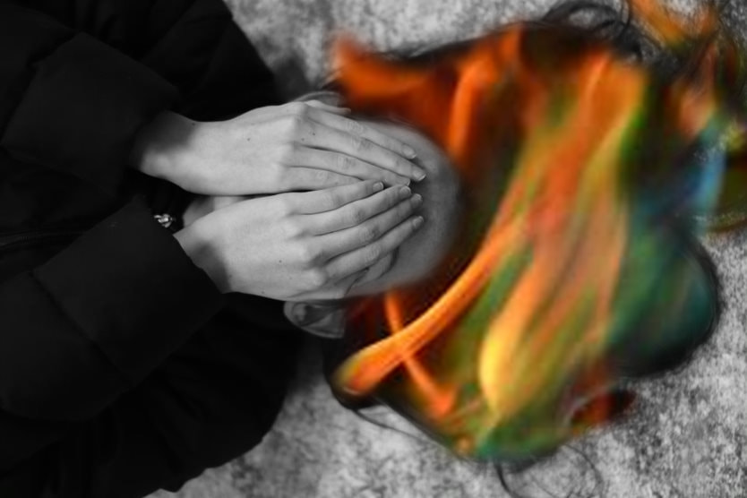
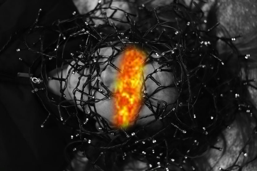
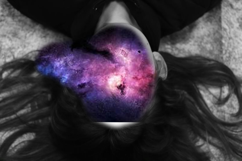
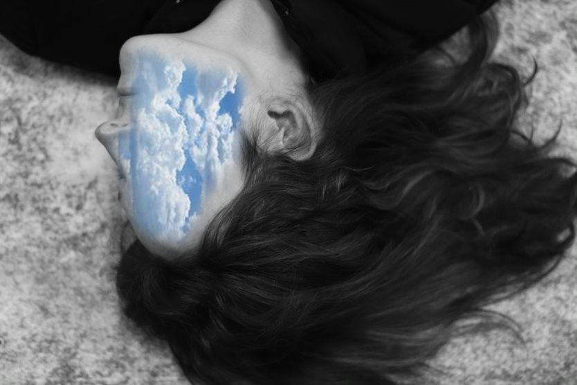
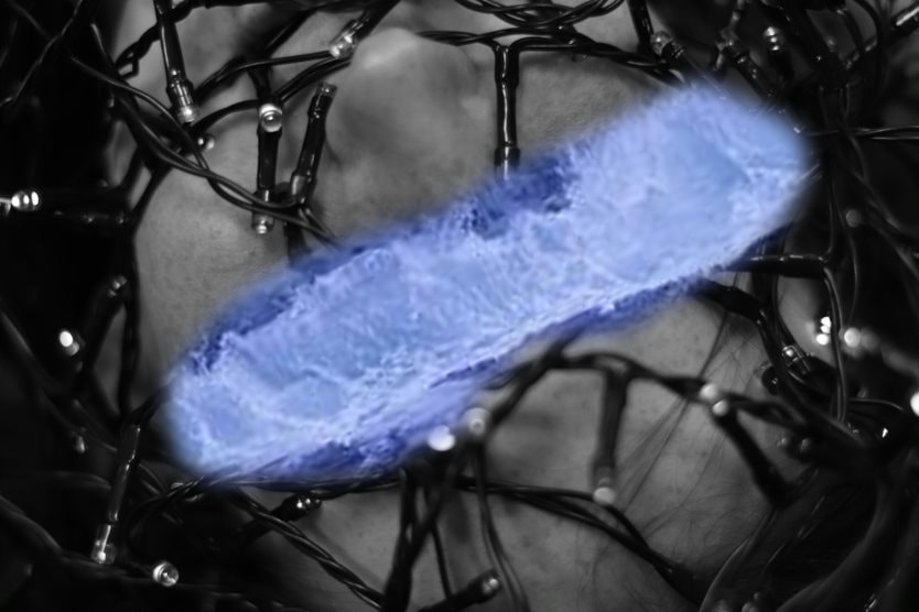
My idea is to have a girl lying on the floor with light around her head representing thoughts swirling around her, almost consuming her. I have drawn inspiration from Sara K Byrne because she portrays an interesting concept, which I feel would add to a chaotic and disorderly theme. I also complimented Sara K.B’s images with light drawings which will additionally add to the theme I’d like to portray. I plan for the shoot to take place outside because it would give a more disorganised and chaotic theme. The props I intend to use are a light wand, tripod and a camera. The light wand will be used for the swirling light beams and the tripod to steady the camera. The lighting conditions I will require are dark. I will experiment using low key because it will illustrate a darker atmosphere. My subject will be front-lit to highlight her facial features. The lighting will be artificial light. I will adjust the white balance on my camera to custom. I intend to use a small aperture f/22 for a large depth of field.
|

|
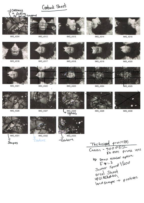
Contact Sheet:
Shoot:
|
|
|
|
|
|
|
|
|
|
|
|
|
|
|
Editing Process
Edited Images:
|
|
|
|
|
|
Final Outcome

|

|
Composition Design 3
initial inspiration:

|

|

|

|

|
|
|

|
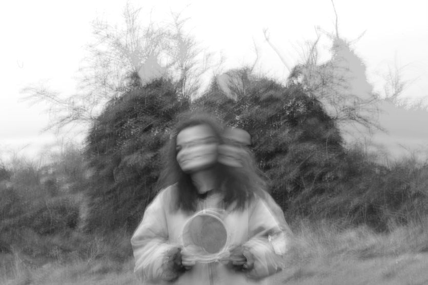
I will combine Laura Williams’s ideas and I will use long exposure too. The reason I carefully selected this artist is due to the fact it is abstract and creative. The aim of the shoot is to emulate Lauran William's work using double exposure. I will successfully do this by ensuring that I look back at my previous images and try and learn from the mistakes, so I don't make them in this composition.
shooting plan:
This shot will be divided into two parts: the model and the natural world. This is due to the fact that the two sets will be combined to generate the double exposure shot, and then printed out to perform physical manipulations like burning, stabbing, and sewing. My shot will take place in a field during the day. I'll be photographing near the water, among the trees. I'll have to think about how near I am to the lake and how far away I am from the woods. I'll also have to keep an eye on the weather to ensure that the area isn't too muddy and that my model stays clean.
I won't be utilising any props, but the trees and bushes, will be the subject of the shoot. I will use natural lighting and I'll play with the lighting around my subject to see what works best for the second exposure - a silhouette might work well.
Contact Sheets:


|
|
|
|
|
|
|
|
|
|
|
|
|
|
|
BNW

|

|

|

|

|

|

|

|

|
Best Edits
|
|

|
|
|
|
Final Outcome:

|

|
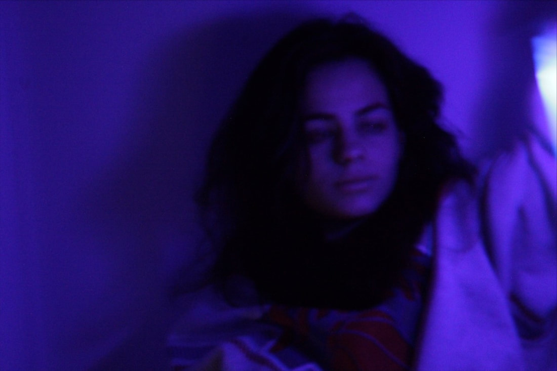
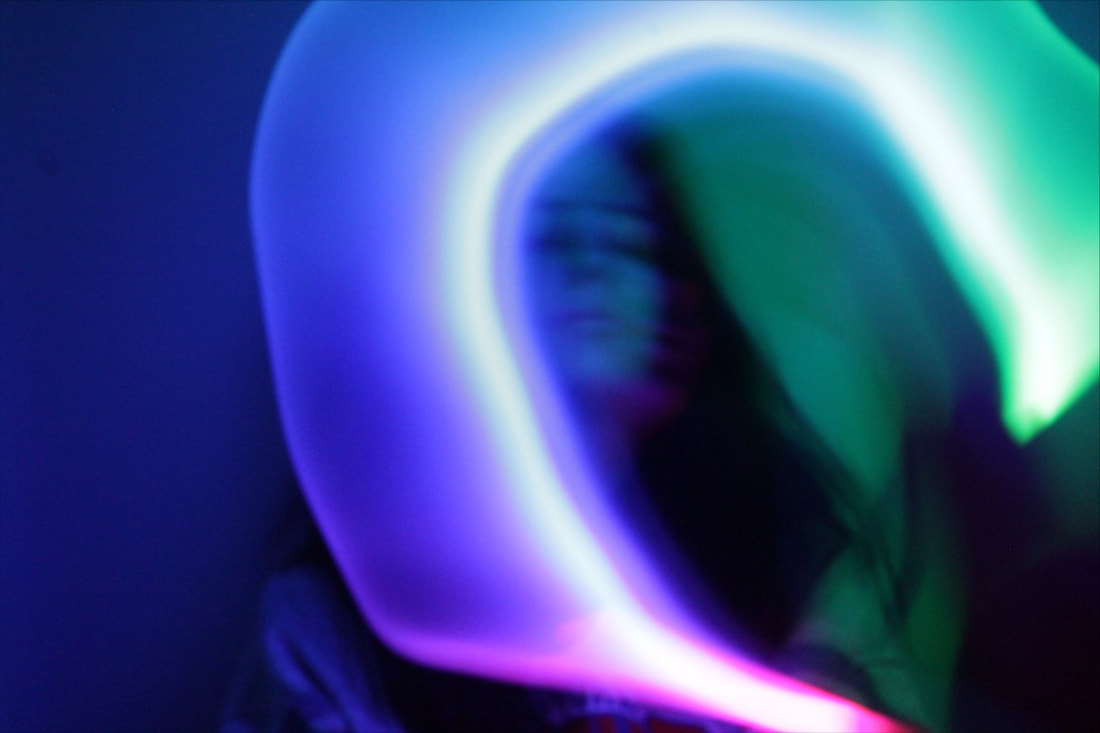
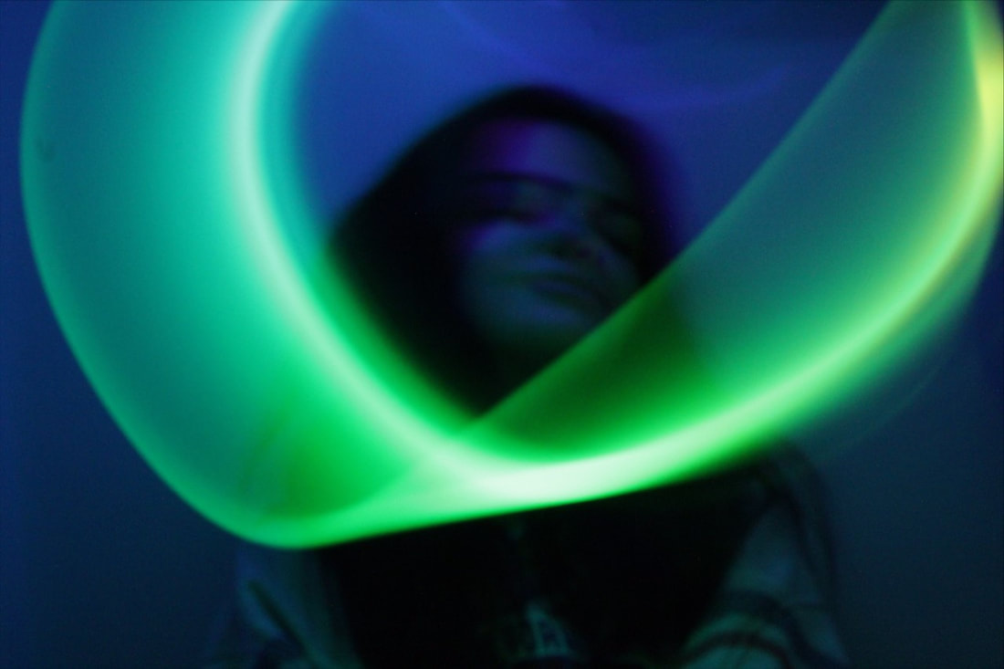
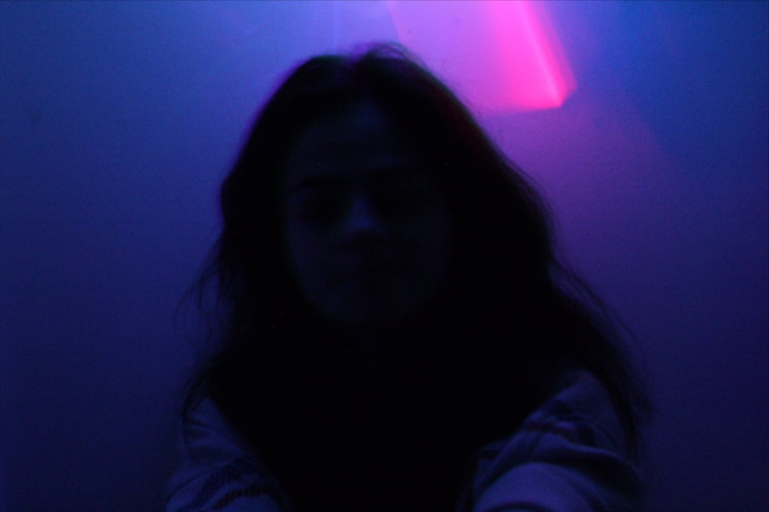
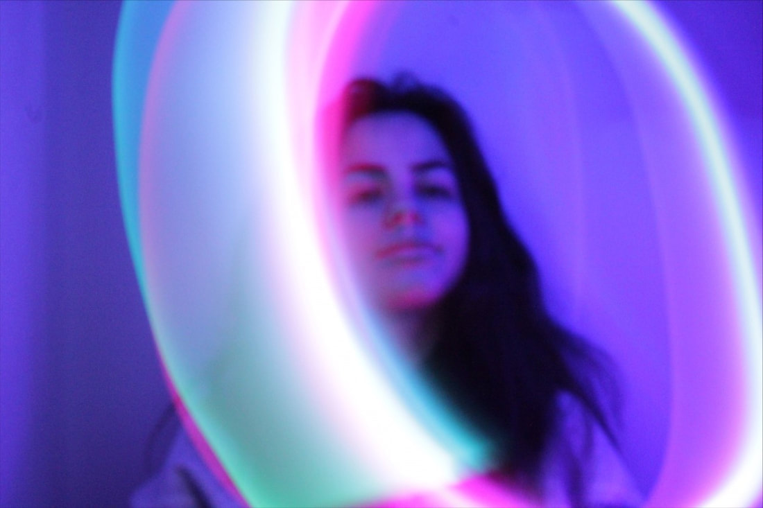
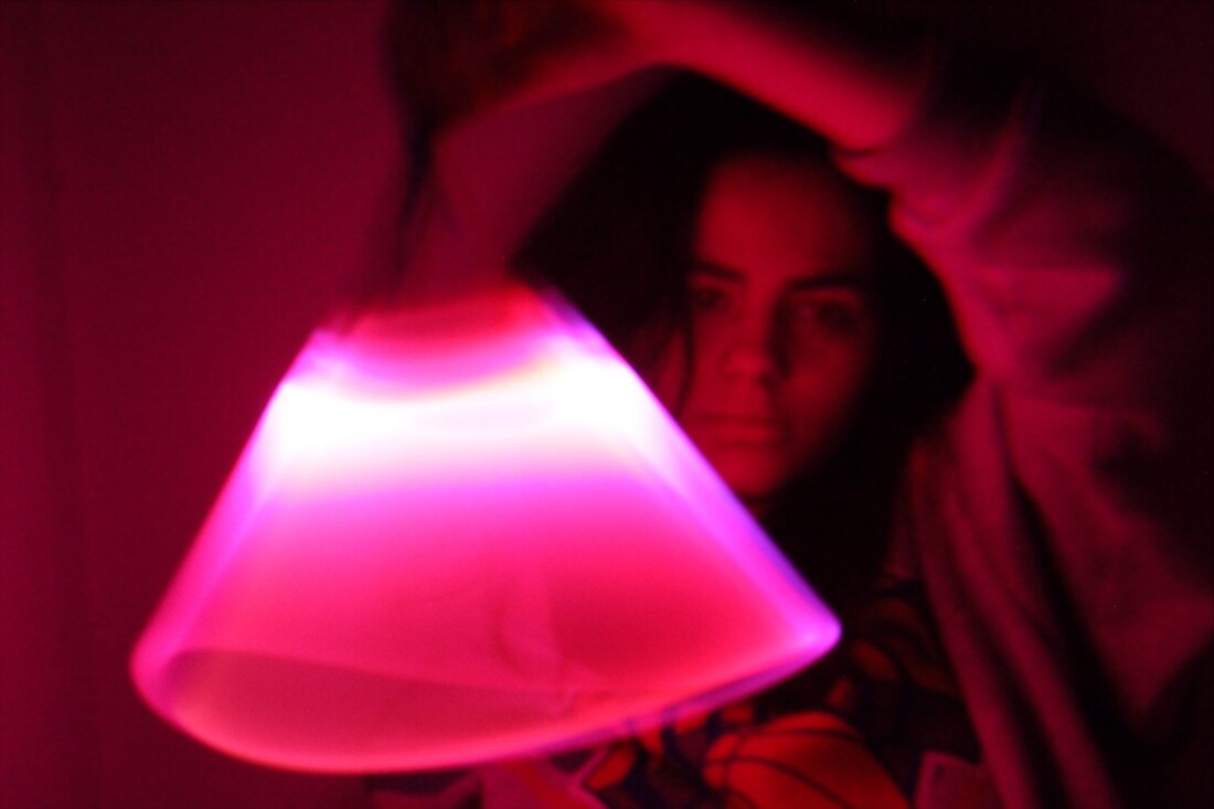
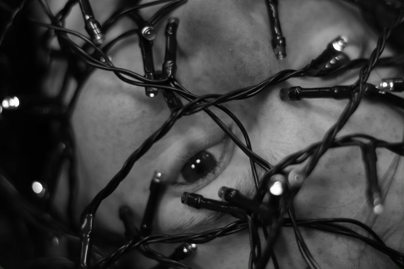
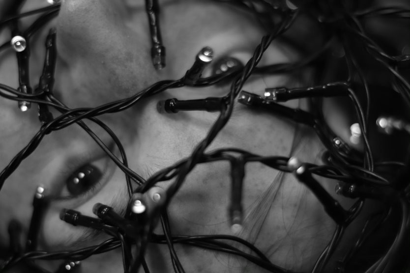
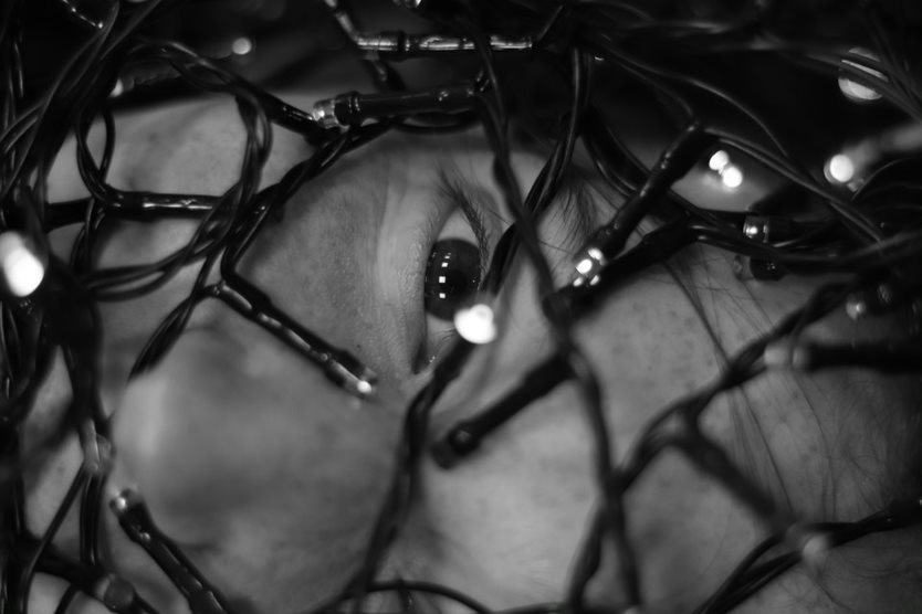
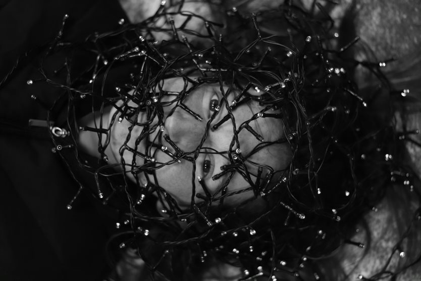
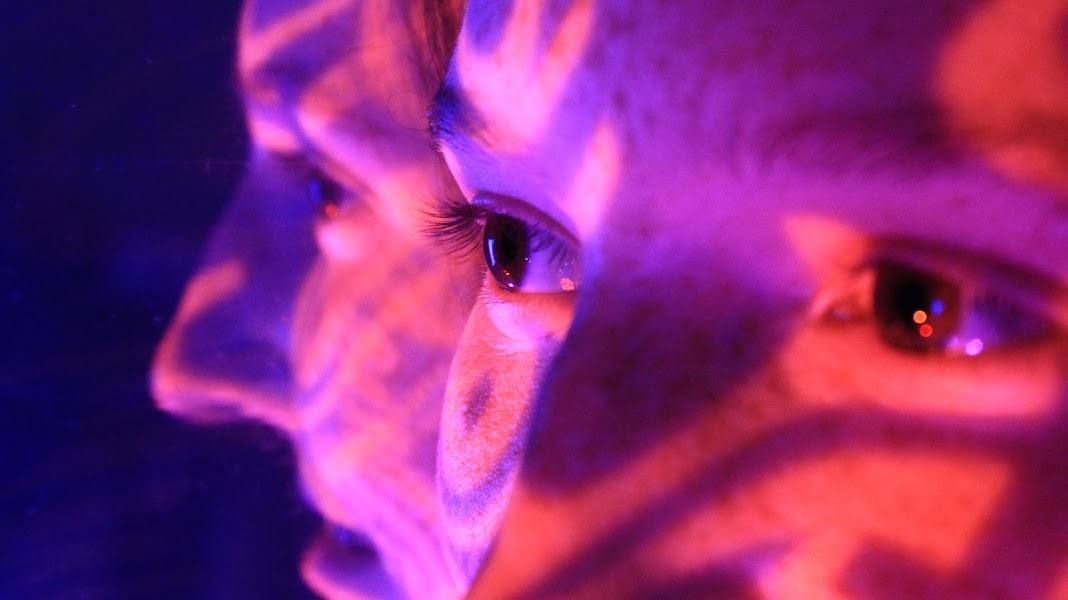
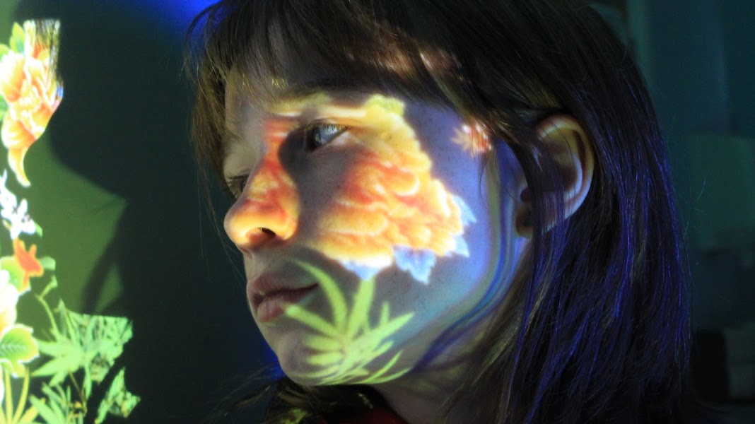
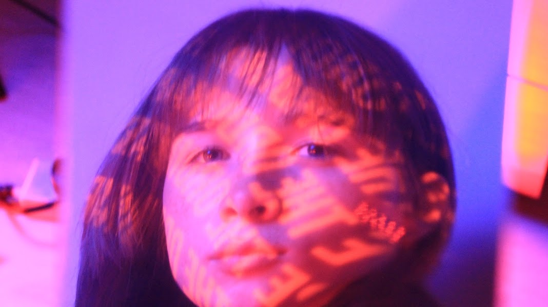
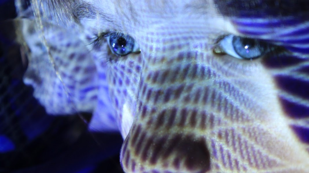
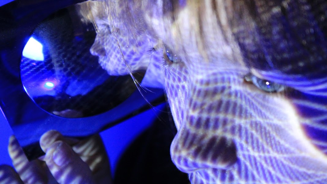
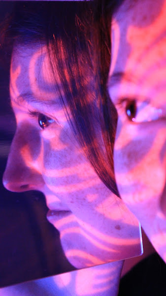
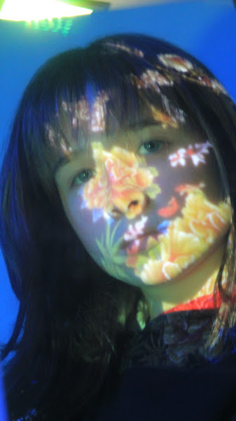
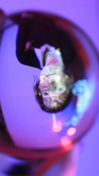
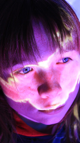
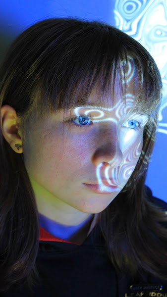
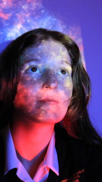
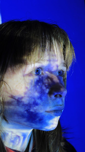
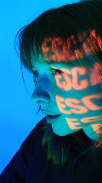
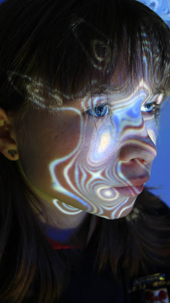
Light Projection Portraiture Workshop
|
|
|
|
|
|
|
|
|
|
|
|
|
|
Mock Evaluation:
Throughout this project, I have developed my understanding of Portrait and Identity by using inspiration from multiple artists, I really feel I have gained many key skills from this project which I hope to take to my last project "urban environments."
Initially I looked at the work of Denis Sheckler, I liked the way he transformed female faces to create someting new. Often his images appear quite shocking and surreal. I think this is because he manipulates the model's faces, replacing their eyes. You are often left with an image of a person that has had their humanity removed.
Next I looked at the work of Sara K. Byrne as I liked the fairy tale imagery she created. She takes outlines of people but fills them with aspects of nature, altering the atmosphere and mood of the image. While doing this, she keeps the outline of the person. The effect is to allow the natural world used to fill the person's outline and become their personality. I liked the effect as it made it feel as if you were getting to look inside the person. It also showed how closely humans are linked to the natural world.
My research then took me to Laura Williams who used mirrors and frames to remove aspects of a person and replace it with the background. The effect is quite striking and makes the viewer take a double look at the image and challenge their thinking. Like Byrne, Williams' work explores our relationship with nature although in a different way. In Byrne's work the natural world is used to reflect the person's personality. However, in William's work, the use of mirrors allows the viewer to look through a person, perhaps suggesting that humans are nothing without nature. It almost gives humans an empty feel in some images whereas in others it makes you feel that we are nature.
I feel like the most successful shoot was composition 2, as I combined my light drawing shoot that I produced previously and a new shoot together. I used space, depth of field overlays to convey meaning and a powerful atmosphere. The lighting was low as I did the shoot in noon; however I feel that it has good contrast between light and dark. I used natural light and a high vantage point to further convey a powerless tone. I successfully edited it on pixr, combining the light drawing and the new image together.
In reflection, I need to improve the number of shoots, add more to the contract sheet and add more techniques. I need to consider more viewpoints and framing for my shoots and I could improve my editing skills by using different lens to improve my skills.
However, I am pleased with the images I have created and I have learnt a lot through the process of creating the images.
Sources Portrait and Identity
Berube, Jennifer, The Story Behind This Viral Invisible Girl Photo by Laura Williams (phlearn.com)
Colossal, Double Exposure Portraits by Sara K Byrne | Colossal (thisiscolossal.com)
Digital Work by Denis Sheckler, https://www.collater.al/en/denis-sheckler-pills-for-skills-graphic-design/
Don’t lose your Head over Denis Sheckler’s Portraits, https://www.fisheyemagazine.fr/en/scheduled/curiosities/denis-sheckler-lose-your-head-collages-curiosities/
How to create Double Exposure in Pixlr https://www.youtube.com/watch?v=LeWYNeWgNcw
PetraPixel, Invisible: Laura Williams Talks About Her Surreal Self-Portrait that Went Viral, Invisible: Laura Williams Talks About Her Surreal Self-Portrait that Went Viral | PetaPixel
Resource Magazine Online, Sara K. Byrne: Flora and Fauna personified, http://resourcemagonline.com/2013/04/sara-k-byrne-flora-and-fauna-personified/24169/?msclkid=c726a77dc0a311ec8c415c3544e1e4d7
Riebschlager, Paula Lou, The Duality of Human Being Expressed By Pablo Thecuadro - IGNANT
Senator, Chiara, The Abstract Collages of Pablo Thecuadro, Interview with young artist Pablo Thecuadro - The Fashion Atlas
Williams, Laura, Portraits — Laura Williams Photography
Zhang, Jenny, 18 Year Old Photographer’s Spectacular Conceptual Self Portraits, 18-Year-Old Photographer's Spectacular Conceptual Self-Portraits (mymodernmet.com)
